
|
||
| HOME : BUFFING : LIE-DETECTING : ILLUSTRATION |
| Digging |
| Crunching |
| Buffing - Tour - Picturing - Describing - Lie-Detecting - Explanation - Illustration - Worksheets - Review - Evaluating |
| Reference |
 ILLUSTRATION
Six ways of being 'economical' with the truth
Contents:
- Value judgements
- Inadequate summaries of data
- Choice of scale for graphs
- Incorrect pictogram size comparisons
- Coincidences
- Generalising from very small samples
1. Value judgements
Of course, numbers contain no value judgements. Data simply provide factual material that could be useful on one side or another of an argument. It is possible, though, to present the data in ways that indicate to the reader how they should feel about it. The simplest way is by using simple verbal tricks
Imagine that a poll of senior executives in UK manufacturing industry reveals that their mean annual pay is £200 000. This fact can be presented as follows:
"The mean annual pay for these executives is £200 000."
A management representative might report the same information as:
"The mean annual pay for these executives is only £200 000."
Adding the word 'only' into the sentence does not clarify the information. What it does do is to suggest that average executive pay is low. There is no supporting information to back-up this suggestion.
A more extreme example is the following common kind of statement:
"If all the European Union's bureaucrats were laid end-to-end, they would stretch from London to Lisbon."
The idea here is not to present numerical information, but to suggest to the reader that there is a very large number of EU bureaucrats. Indeed, the reader is encouraged to believe that there are too many such employees.
[Top]
2. Inadequate summaries of data
Without summary statistics, interpreting data would often be impossible. Having said this, reducing a vast data set into one or two measures is a process that can be taken too far. Once again the outcome of this frequently is that a false impression can be created in the reader's mind. An example of this type of distortion is population summary statistics.
In 2001 the population of Canada was estimated to be 31 million. The land area of Canada is 9976 000 km2. Canada could be said to have an average of 3.1 people per km2.
But, Canada's population is dispersed unevenly across the country. In Ontario, for example, there is a population density of 11.7 people per km2. Also, over a third of the total Canadian population lives in Ontario. The single summary statistic is kept low due to the effect of some large, but sparsely populated areas. Yukon, for instance, has a population density figure of 0.06.
The average population figure for the country tells us very little. Looking at only the mean number of people per square kilometre, we might make assumptions about the uniformity of population density in Canada. (Source: Statistics Canada and the Economist).
[Top]
3. Choice of scale for graphs
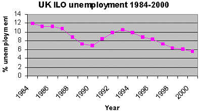
The graph below shows the ILO unemployment rate for the UK between 1984 and 2000.
 |
Source: National Statistics
Two peaks and troughs are apparent: a reduction from a peak of 12% in 1984 to a low point of 6.5% in 1990, followed in 1993 by a rise to just over 10% which subsided to below 6% in 2000.
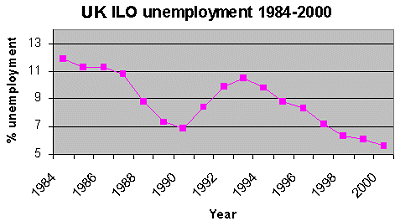
Precisely the same data is plotted in the second graph, but now with a different scale on the vertical axis:
 |
Source: National Statistics
The new graph shows unemployment falling close to the horizontal axis. This gives the impression that there has been a sharp fall in unemployment over the period, to what might be confused to zero by the unskilled reader.
By selecting a particular scale of measurement you can create impressions of either relative stability or large fluctuations in a time series. There is however no absolute correct scale for a graph. What this example shows is that instead of only looking at the shape of the line plotted in a graph, you should look at the scale on which the graph's axes are based.
[Top]
4. Incorrect pictogram size comparisons
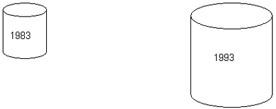
UK Consumer spend on drink/tobacco
1983 £ 19479 m
1993 £ 36261 m
From the above table you can calculate that UK expenditure on drink and tobacco rose by 86% over the period 1983 to 1993. One simple approach to illustrate this change might be to draw a one unit picture - let's use a drinks can here - to show the 1983 data and a 1.86 unit picture to show the change.
But look at the pictogram below. There is clearly the impression given by the chart that spending on these goods has risen by far more than 86%. In fact the second can has an area (1.86)2 = 3.46 times the area of the first, which would indicate that spending on drink and tobacco has more than trebled over the period, (in other words, over 300%). It's even worse if one considers the volume: the can has a volume of (1.86)3 = 6.43 times the volume of the first!
 |
In
fact, this is relatively simple to correct. The area of the can
representing 1993 spending, should be 1.86 times the area of the can
for 1983. So, the height and width measurements of the 1993 can should
be in the proportions of  1.86 = 1.36 units.
The measurements can now be adjusted in these proportions to produce the following, corrected pictogram:
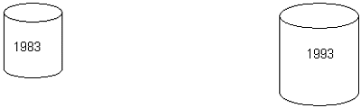 |
UK Consumer Expenditure on Drink and Tobacco 1983 to 1993
Source: National Statistics
[Top]
5. Coincidences
When Tottenham Hotspur Football Club reached the English Football Association (FA) Cup semi-final in April 2001, many supporters and analysts reckoned that the fates were about to look kindly upon the club. Spurs' record in the cup, the most famous club cup competition in the world, indicated that this was 'their year'.
Spurs had won the FA Cup on five previous occasions when the year ended with a '1': 1901, 1921, 1961, 1981 and 1991. Surely 2001 was to be Tottenham's year once again.
But in the event, an 'Oh One' became an 'Oh No', as Spurs met Arsenal in the 2001 semi, with Tottenham's north London rivals winning 2-1.
This is just one example of an occasion when we are told that a conjunction of events is 'too much of a coincidence' to be coincidental.
What is important to remember is that even though improbable events do occur, it is their unlikelihood that makes them remarkable. If there was a pattern to events such as this, they would be, of course, less remarkable and less of a coincidence. An example of this is Manchester United's dominance of the English Premiership competition.
Unfortunately for many football fans, it is the persistent ability of sport to suggest these 'coincidences' that continues to plague the lives of many otherwise perfectly rational people.
[Top]
6. Generalising from very small samples
"Four out of five beer drinkers prefer lager to bitter." Should you feel confident about this kind of quantitative statement, or should you view it with scepticism? It depends upon the sample size drawn from the total beer drinking population, on which the statement is based.
If 3000 beer drinkers have been approached and a preference for lager expressed by 2400 of the sample, then there would be substantial evidence in favour of the opening statement.
But if the research is based on a very small sample, say 5 drinkers in a couple of bars or pubs, with 4 of them preferring lager, then you should be much more wary of relying on the result of the survey. After all, it is quite possible that the same question put to another 5 drinkers would produce entirely the opposite result.
Even if you believe the result to be justified by your experience, it is very dangerous to generalise about a population on the basis of a very small sample. As you can see elsewhere on TimeWeb, conclusions about a population on the basis of a sample, becomes more precise the more the sample size increases (but, significantly, only up to a certain point). Very small samples often tell us very little, if anything, about a wider population.
More on sample size
[Top]
More lies:
A North American journalist, reflecting on the balance between a story's accuracy and readers' interest, cited the example of winter snowstorms and the ensuing chaos caused to state road transport.
Whenever it snowed heavily, reporters would call the sheriff's office to find out how many 'fender-benders', (collisions resulting in damaged car bumpers), had been recorded. This information would then be dressed-up into a report in the following day's newspaper that invariably would read something like: 'Fierce winter storms dump a foot of snow, create traffic havoc and cause 30 fender-benders on county freeways.
When the journalist rang the sheriff's office to ask how many accidents were usual on days when road conditions were perfect, the answer was 50. This prompted the reporter to wonder if in future he should write stories with the by-line 'Fierce winter storms prevent 20 fender-benders on county freeways'.
It was not clear whether there were more accidents per mile travelled in the snow, but the police information showed that there were fewer accidents when it snowed than when it did not.
[Top]
Misuse of data
Research conducted at a football ground in 2000, found by observation that approximately 60% of empty cigarette packets were 'contraband'.
This seemed to indicate that a large proportion of cigarettes smoked in the UK have paid no duty - thereby reducing the total tax taken by the government.
When this finding was reported on radio news, it provoked a phone call from a spectator at the same football match that was the focus of the research. This caller pointed out that as a frequent overseas business traveller (and a smoker), they bought large quantities of cigarettes in foreign countries and often gave packets to friends.
These cigarettes were legally obtained, duty-paid in the country of purchase. Therefore no tax fraud had been perpetrated in this case. Perhaps more accurately, the research suggests that rather than getting hold of 'bootleg' cigarettes, many smokers 'get their fix' from informal networks of friends.
The lesson for the government may be that they should examine the difference in levels of duty between the UK and other countries. People able to avoid the tax legally are, by definition, not criminals.
It is clear from these events that extreme care should be taken when interpreting even the most apparently persuasive data.
[Top]