![]()
![]()
![]()
![]()
![]()
![]()
![]()
![]()
![]()
![]()
![]()
![]()
How to Construct Bad Charts and Graphs
Gary Klass
Department of Politic and Government
Illinois State University
© 2001
The three fundamental elements of bad graphical display are these: Data Ambiguity, Data Distortion, and Data Distraction.
Data Ambiguity:
Data ambiguity arises from the failure to precisely define just what the data represent. Every dot on a scatterplot, every point on a time series line, every bar on a bar chart represents a number (actually, in the case of a scatterplot, two numbers). It is the job of the text on the chart to tell us just what each of those numbers represents. If a number represented in a chart is, say, 33½, the text in the graph -- in the title, the axis labels, the data labels, the legend, and sometimes the footnote -- must answer question: "Thirty-three and a half what?".
Data Distortion.
Before the development of spreadsheet graphing, the most common graphical mistake was the use of artist-drawn 3-D images with the height of 3-D objects representing the magnitude of the data points. In these charts, both the height and the width of the drawn object increase proportionate to the magnitude of the data points. The effect is to exaggerate the differences in magnitude as the viewer tends to perceive the area of the figures rather than just the height as representing the magnitude. The incredible shrinking family doctor (shown in Tufte, p. 69) is a classic example. In this chart the 1990 doctor is a bit less than half the height of the 1964 doctor. Each doctor has the same relative shape. Image two doctors with the same average physical shape, one less than 4 feet tall, the other 8 feet tall. If the 4 ft. doctor weighed 100lbs., how much would the 8 ft. doctor weigh? Certainly much more than 200lbs.
| The Shrinking Doctor | The Shrinking Dollar |
 |
 |
| source:LA Times, August 5, 1979 from: Tufte, p. 69 |
source: Washington Post October 25, 1978 from: Tufte, p. 70 |
[Click on chart thumbnails for full image]
With the development of spreadsheet graphics, such visual distortions are no longer common, and the Art of Lying with graphics has become a technology rather than an art. Today, altogether new forms of bad graphical design predominate.
Most of the bad charting described thus far has the redeeming feature that it does not for the most part distort the data being represented by exaggerating or understating the values of some of the data points. We will consider now some of the more complicated ways of using graphical display to mislead. Figure 5 is a time series chart originally printed in a public policy textbook authored by four professors of political science employed by three public universities.
| Figure 9-12
Average Tuition, Room and Board as a percentage of Median Family Income, 1964-1995 |
 |
| chart source: Cochran, 347 |
The interpretation of the graph is as follows:
There is some evidence that the cost of higher education may not have escalated so much... Figure 9-12 reflect the average cost for tuition, room, and board as a percentage of median family income from 1964 to 1995. While private institutions have increased costs substantially, public university costs have remained constant. This indicates that the increased costs associated with higher education may be quite reasonable when compared to family income levels. (Cochran 346-7)
Note the ways in which the authors have understated the rising costs of public university education. First, the costs are deflated not by adjusting for the consumer price index but by median family income -- especially for the years after 1982, median family income rose much faster than the consumer price index. Second, graphing both the private and public data on the same graph enlarges the scale on which the public data is displayed. It's hard to tell from the graph, but between 1980 and 1995 it appears that public university costs increased from around 11% of family income to near 15% -- in effect the share of family income going to public university costs has increased by a third. The third way of minimizing the cost increases that have occurred since 1980 is to extend the time series back to 1965.
A completely different picture emerges if one were to compare the rate of increase in public university costs to the rate of increases in other sectors of the economy. On the left, we see that from 1981 to 1999 -- over the lifetime of today's college student -- public university costs have risen faster than any other sector of the economy. Faster even than rising medical care costs. In addressing the topic of health care inflation, the same authors note that: "Cost escalation in the medical field has been constant," and spend four pages of text addressing the reasons for the increases. (pp. 268-72).
Examine this chart from the UNICEF that purports to demonstrate that the gap between rich and poor countries is increasing. We can see that the per capita GNP of the wealthiest countries has slightly almost doubled (from about $12,000 to about $26,000), but it is not clear that the GNP hasn't doubled or tripled among either the middle or low income countries.
Here's an example from the same source that seems to distort the data. Note the size of the two arrows, but look carefully at the first arrow -- the negative $18 change is represented not by the arrow, but by the little line below it.
Data Distraction:
Edward Tufte's fundamental rule of efficient graphical design is to minimize the ratio of ink-to-data. This is essentially the same advice offered by Strunk and White to would be writers:
"A sentence should contain no unnecessary words, a paragraph no unnecessary sentences for the same reason that a drawing should contain no unnecessary lines and a machine no unnecessary parts." (23)
The primary source of extraneous lines in charting graphics today are the 3-D options offered by conventional spreadsheet graphics. These 3-D options serve no useful purpose; they add only ink to the chart, and more often than not make it more difficult to estimate the values represented. Even worse are the spreadsheet options that allow one to rotate the perspective. For those who would take bad graphical display to even higher levels, the Excel spreadsheet program offers the option of doughnut, radar, cylinder, cone, bubble charts.
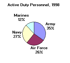
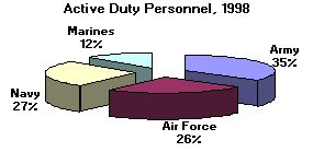
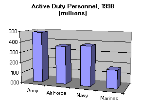
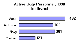
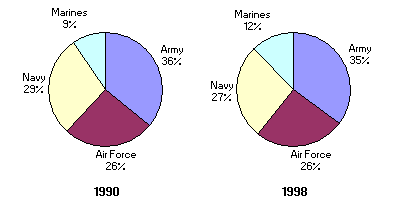
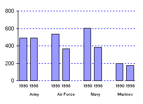
2-D Pie Chart 3-D Pie, Exploded 3-D Column Bar Simple 2-D Bar Pie charts should rarely be used. It is more difficult for the eye to discern the relative size of pie slices than it is to assess relative bar length. With a the pies, without looking at the numbers it is difficult to figure out whether the Navy or Air Force is larger; from the bar charts it is obvious. 3-D pie charts are even worse, as they also add a visual distortion (in this case, making the Air Force appear much larger). Note how much less ink the 2-D bar charts uses compared to the 3-D bar. Using data labels rather than a y-axis scale in this case reduces the number of numbers displayed from 6 to 4, and adds precision as well. Normally, I would have sorted the data here, so that the Navy would be between the Army and Air Force, but since the Marines are a part of the Navy (and the Air Force, originally, a part of the Army), this order made more sense. A strict application of the ink-to-data in this case, however, would eliminate the bars altogether and simply present the data as a table.
Pies are even less effective when an additional variable is added and comparisons between pies are required (sometimes by adjusting the relative size of the pies).
Not content with the distractions and distortions made possible by the use of 3-D effects, charters sometimes feel the need to add all sorts of other Chartjunk to a graph. In the graphics on the left, Kevin Phillips (1991, 9) is trying to make the point that income is more inequitably distributed in the United States than in other countries.
Note the extraneous features of this in this graphic.
- A completely irrelevant map of the world.
- Two entirely different kinds of 3-D charts displayed at two different perspectives.
- Country names are repeated three times.
- To display 24 numeric data points, 28 numbers are used to define the scales.
- The countries are sorted in no apparent order (not even alphabetically).
- Note the use of the letter " I " to separate the countries on the bottom chart.
While it might be possible to display these data better graphically, a table does the job quite nicely:
Two chart types that should always be avoided.
Two common charts easily produced by spreadsheet programs that should almost always be avoided are the stacked bar chart and the pie chart. The stacked bar chart, made even worse by the use of 3-D effects in figure 3, makes it very difficult to estimate the values of the variables represented on the top of the bars. Similar "stacking" can also been done with time series area charts and should be avoided as well.
Figure 3: Stacked 3-D bar chart source: Putnam, p. 227 Pie charts are fun to look at, but generally involve using a great deal of ink to display very little data. In addition, the charts often make it difficult to discern the exact magnitude of the size of the pie slices. Using multiple pie charts to display more than one variable is also a bad idea. All this is made even worse by exploiting the power of the spreadsheet technology to produce 3-D pie charts and "exploding" 3-D pie charts. If you think that you really must use a pie chart, make sure it is for data that does indeed at up to a total (i.e., the percentages for the slices add up to 100) and stay away from the fancy stuff.
Bad Chart 2: Where do the lines cross? Phillips, p. 206
References:
Clarke Cochran et. al. American Public Policy: An Introduction (1999: St. Martin's Press)
Kevin Phillips, The Politics of Rich and Poor (1991: Harper Perennial)
Putnam, Robert D., Bowling Alone (Simon and Schuster, 2000)
Strunk, William Jr., and E. B. White, The Elements of Style 3d edition (MacMillan publishing, 1976).