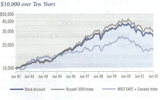
If you look more carefully, you can see that the vertical axis uses a logarithmic scale to plot the dollar amounts! It also starts from a base amount of $10,000 rather than $0 (a common ploy of TV weather men as well!)
The other day I received the semiannual report from my retirement fund, CREF. As everyone knows, the stock market hasn't been doing well. It wasn't a surprise to see that the value of CREF stock accounts had taken a hit.
However, the figures that were provided in the report didn't look all that bad. A glance at them would suggest that the value of the CREF stock account had only dropped ~15%. For example, here's one of the figures scanned from the report:
If you look more carefully, you can see
that the vertical axis uses a logarithmic scale to plot the dollar amounts!
It also starts from a base amount of $10,000 rather than $0 (a common ploy
of TV weather men as well!)
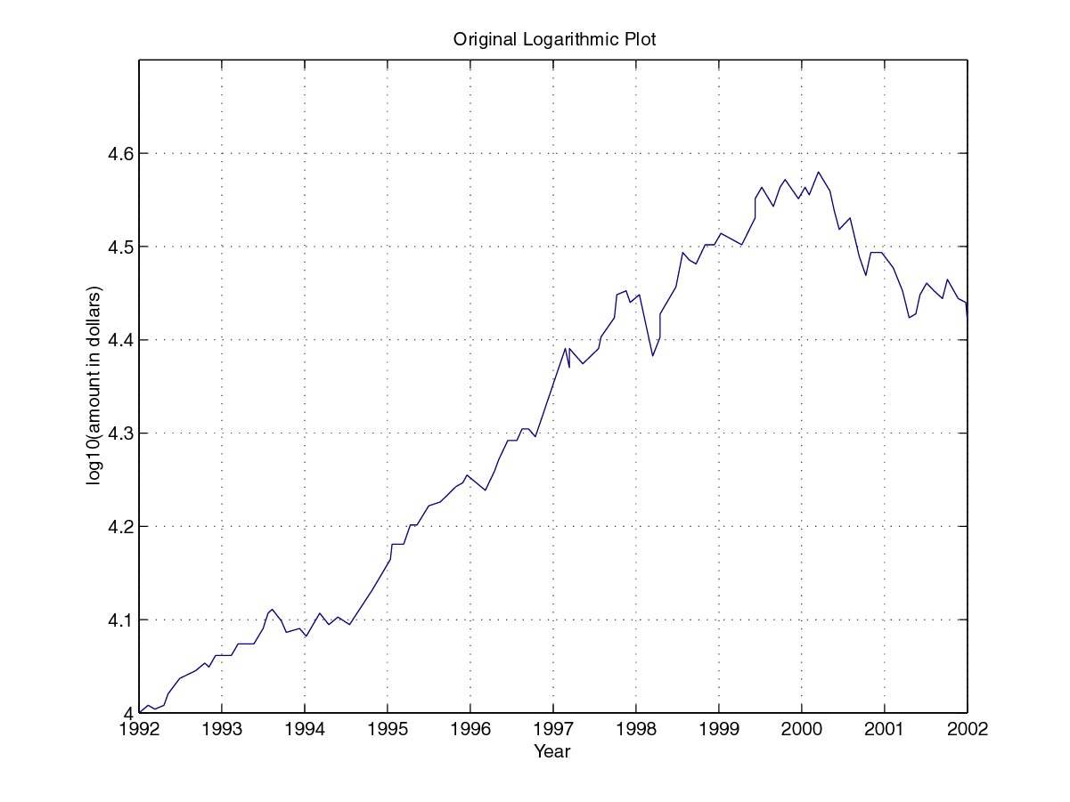
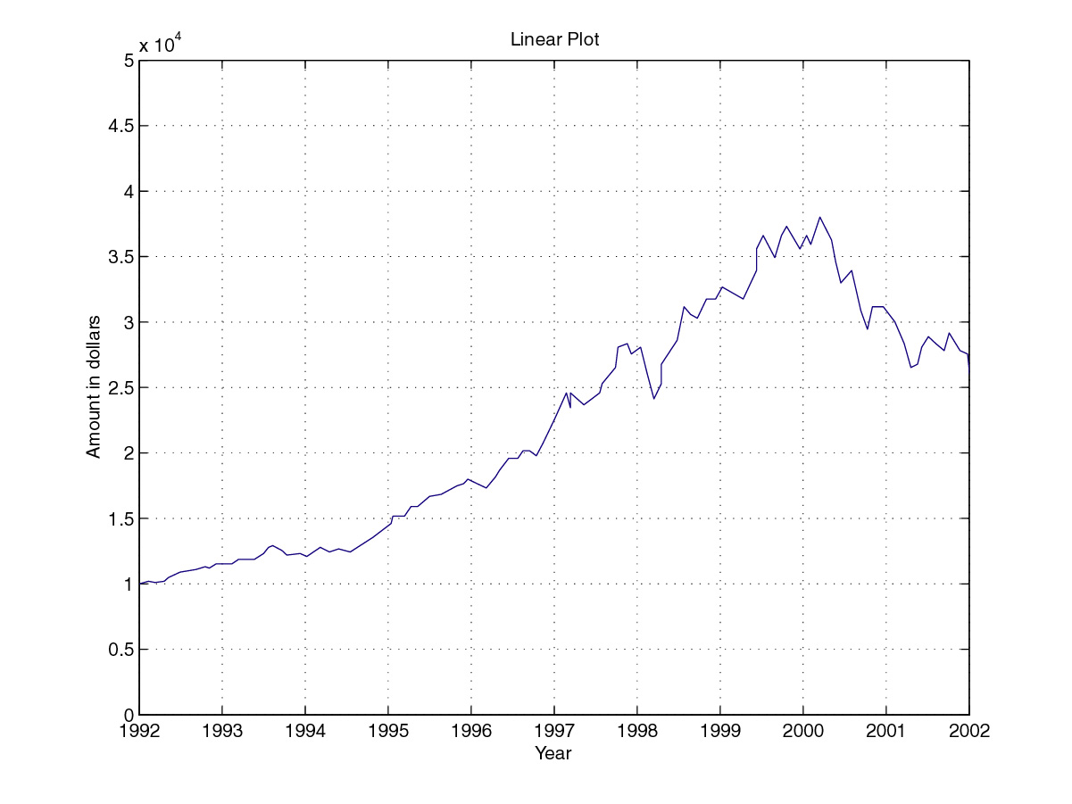
The "Stock Account" graph was digitized and converted into a simple linear plot. Here is my digitization of the original plot:
Here is the conversion to a simple linear scale with the origin at $0. Clearly, it appears that account lost over one third of its value since year 2000!
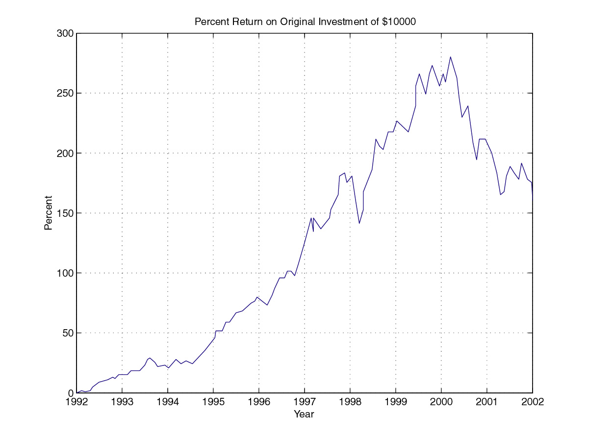
Now, I'm not complaining too much (yet!). Since 1992 this account hasn't done too poorly. If the percent return on the original investment is plotted, the CREF stock account still looks good even after the market fall since year 2000.
Of course, if you were new faculty in
2000 and started contributions to CREF it is very likely that you would
not be too happy right now. Here's the equivalent annual interest
since 1992:
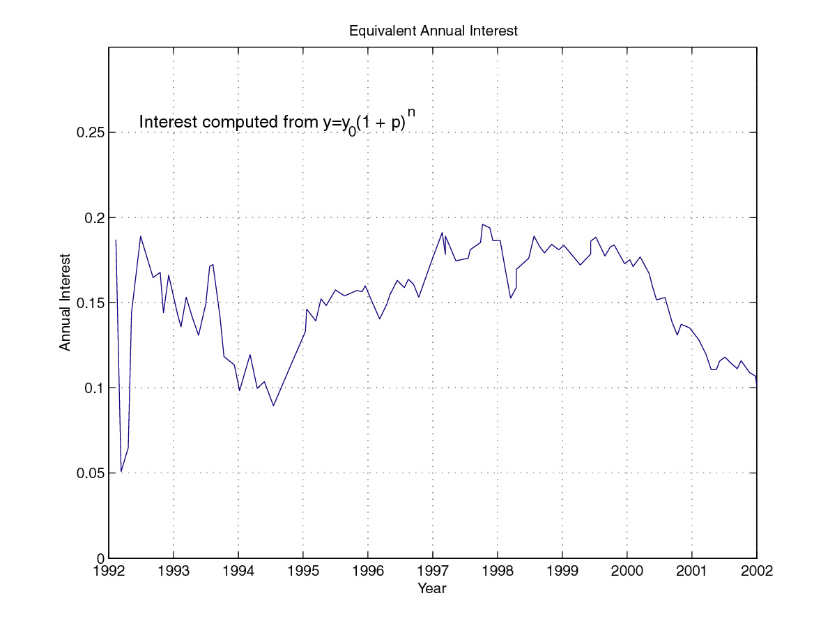
Obviously, this account looks good if
compared to a start in 1992 but would be dismal if compared to a start
in year 2000. There would be negative interest rates!
It all goes to show that appropriate representation of your data can mean the difference between success and failure!
Unfortunately, much of today's academia is based on these same rules of perception where use of color graphics or clever manipulation of statistical data makes the science.
Don't let people fool you. Look
carefully a data presentations and make sure you know what they mean.