Last update: 9/13/08
|
|
|
|
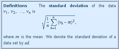
The question of our title has to do with different combinations of browser and MathML fonts. We expect to have a clear resolution of this issue by the end of 2008, but we're in a transitional period until then. In the figures at the left, we show the same definition (from page 9.3.3) as displayed in Firefox 2 and 3 with different sets of fonts.
The first version is in Firefox 2 with MIT fonts. It's not strikingly beautiful, but it's quite readable.
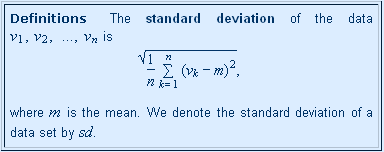
The second version is what one sees after upgrading to Firefox 3 without changing the fonts. The symbols are more attractive, but there is clearly a problem with the square root symbol. Most of the math symbols are fine in this combination, and even square root is all right over a single-level display.
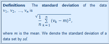
The third version is the result of installing Firefox 3 on a Windows Vista computer without installing any MathML fonts. Notice that Vista comes with its own fonts that look pretty good — but there is a similar problem with square root over a multilevel formula.
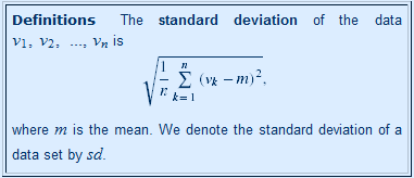
And the fourth version is Firefox 3 with the STIX fonts installed. The square root issue is resolved, but the symbols (in the displayed formula) are a little smaller than in the other cases. If this is troublesome, one can increase the text size (Ctrl+) — MathML formulas scale up with the text size. (But don't try that on this page because those images are screen shots from another computer.)
[Technical note: The non-displayed math symbols in this definition do not appear to change much because they are not coming from embedded MathML code, but rather from ASCIIMathML, a javascript-based system that creates math symbols dynamically as the page is loaded. We use this a lot, but it has some disadvantages for some displays.]
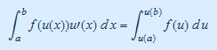
In the following pairs of images, we show the same formulas as rendered in Firefox 2 with MIT fonts (left) and in Firefox 3 with STIX fonts (right). The Firefox 2 images are from a screen with 1280 by 800 resolution, and the the Firefox 3 images from a screen with 1024 by 768 resolution. Clearly more resolution is better.
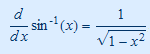
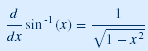
While these come from the same page in the book, they don't appear exactly the same, although both are quite readable.
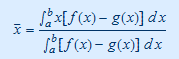
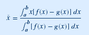
Again there are notable differences, but one stands out: The bar over x in the STIX fonts is shorter and fainter. (The other differences, besides the angle of the integral signs, are largely a function of resolution.)
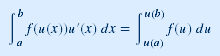
Here there is a striking difference, in addition to angles of the integral signs and resolution: In the MIT font on the left, the prime (designating derivative) is large and not raised — on the right in a STIX font it is properly raised but rather faint. Clearly there is not yet a single right answer for best viewing. But the STIX fonts are still in a beta state, and we can hope that these issues will be resolved soon.