Our Lab today is an example of an applied numerical integration, with data.
- This one will be a little different than our others; fewer Mathematica details and more about the math.
- There's less to do, unfortunately, and more to process. There's a story, however....
- The story:
- Let me start with a sub-story: a sad story about an engineer I knew....
- Today's lab stems from an article I saw in the New York Times, from August of 2024:
How Noah Lyles Won the Men's 100-Meter Gold by a Fraction
Let's start by checking out that page. Who do you think won?
- I enjoyed their visualization, and realized that I might want to talk about this in a calculus class.
- One thing that struck me as I watched the video was that,
from my "seat in the stands", it sure looked like the dot for Thompson
crossed the finish line ahead of the dot for Lyles.
That inspired the desire to model the situation.
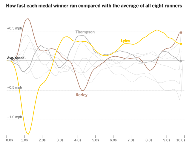
- The other piece that inspired me was their graphic:

What does a calculus student think about when they see this? I'd like to know!:)
- The New York Times is very good about embedding the data
within their graphics, so I went after the
source. (Search: 86.182)
By the way, in preparing this lab I discovered that there's a better data set buried in the source!
- Then we have to strip out the data from that source file,
and process it. For that I used a program in lsp, which
is my favorite programming language.
One thing that you need to know is that this process can be very ugly and tedious! And you have to be careful to get everything right.
- Then you may discover that the data isn't as perfect as
you'd like (all subintervals are not equal; they don't
start at zero).
- So now we turn to the lab, and the mathematics, and see
if we can get some useful results....
NB: this analysis is not complete. There's more that one could (and should!) do; I don't know that I ever will. But this would make a great project if anyone's interested, and one might actually get a publication out of it! I'd be happy to chat about that if anyone's interested.
- Let me start with a sub-story: a sad story about an engineer I knew....
- The Lab
- Wolfram Alpha
- Mathematica on-line is an option, if you are at a computer without Mathematica installed. I've tried it and it worked pretty well!