Projections distort distances. This is especially important as the spatial statistics we are interested in usually involve distances or areas, which can be deceiving in some projections (especially when we do work over large areas of the earth's surface).
Some people have been known to operate with latitudes and longitudes as though they are Euclidean coordinates, and so use distances between two points like
![]()
(which are absolutely meaningless in general) by mistake. The distortion is different depending on which part of the Earth you're on, with maximal distortion at the poles and minimal distortion about the equator:
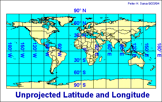
We usually project latitude and longitude into a system such as UTM (Universal Transverse Mercator). ``The Universal Transverse Mercator (UTM) projection is used to define horizontal, positions world-wide by dividing the surface of the Earth into 6 degree zones, each mapped by the Transverse Mercator projection with a central meridian in the center of the zone. UTM zone numbers designate 6 degree longitudinal strips extending from 80 degrees South latitude to 84 degrees North latitude. UTM zone characters designate 8 degree zones extending north and south from the equator.'' From: the University of Texas department of geography.
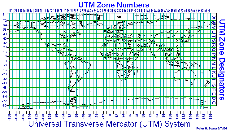
Understand your coordinate system and projections!
Pretty pictures are not necessarily science. Don't fall in blind love with your output! Just because your GIS package can turn some data into a lovely map doesn't mean that it is wise to do so, or that it means anything.
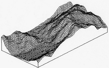
Is this a reasonable surface that you've generated from your data, or utter nonsense?
Here is a lovely interpolation of the FIPS code for the counties of Illinois:
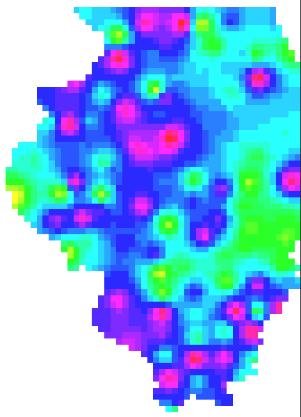
FIPS interpolation produces this pretty map, using inverse distance weighting, but it is utterly meaningless (as the FIPS codes are not spatially correlated, except by sheer chance). This map is garbage no matter how pretty it is.
Garbage or science?
