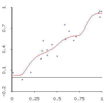

In this case we imagine that the (blue) point data is a noisy sample from the underlying phenomenon, illustrated by the smooth (red) function. For example, this plot might represent a data set calculated by having several different people estimating elevations at various points along a path up a mountain.