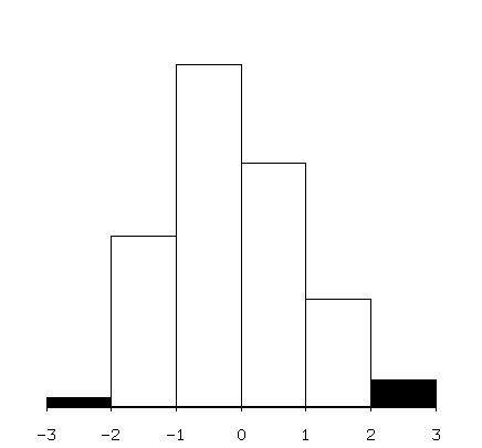
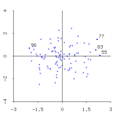
The histogram represents the x-coordinate of the data plotted in the scatterplot, so you see that the extremes of the x-coordinate points of the scatterplot are also selected.
Linking is one very useful way of representing higher dimensional information in two-dimensional plots: here's a set of scatterplots with three points highlighted (Fisher's famous Iris data):
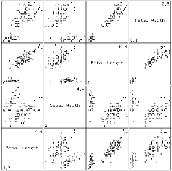
The points are clustered across all four variable pairs (i.e. in four dimensions).
These linked plots were produced using Xlisp-stat a free statistical package based on the lisp language. I find it to be a very powerful (and challenging!) piece of software. It's not easy to learn, but once you've learned it you're glad you did!