Ask yourself this: if you want to estimate (guess) the temperature of a guest Bob, do you
On the other hand, if you were trying to guess how stained a particular patch of carpet is, sight unseen, you might be most interested in knowing about the carpet in the vicinity of the patch. That is, the closer a neighboring patch of carpet, the more it has to do with the patch of interest.
The difference in the two cases is that the first statistic of interest is spatially random, and the second shows spatial correlation. Mappers faced with the first case would probably use the mean temperature (or some other measure of central tendency) of the group. In the second case, they would try to quantify the spatial correlation, and use it to improve their estimates based on how helpful they expect a given neighbor to be.
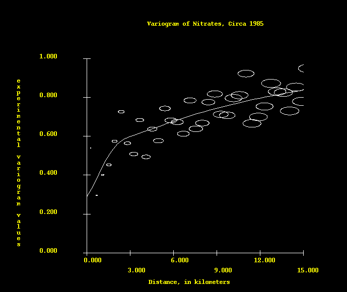
. The data themselves give us some idea of what the variogram looks like,
then we model it with a function which allows us to do our estimation by
quantifying the relative confidence (trust) we have in neighbors as a function
of distance. We would like to see a variogram that increases smoothly as a
function of distance, which says that trust falls off smoothly with distance.
This one, a variogram of an image of Abe Lincoln's
face, shows a degree of trust that is lost by about eight pixel
lengths.
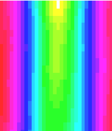
Here are some two-dimensional variograms (showing variation as a
function of distance AND direction/angle). Here's one of a random scattering of
data 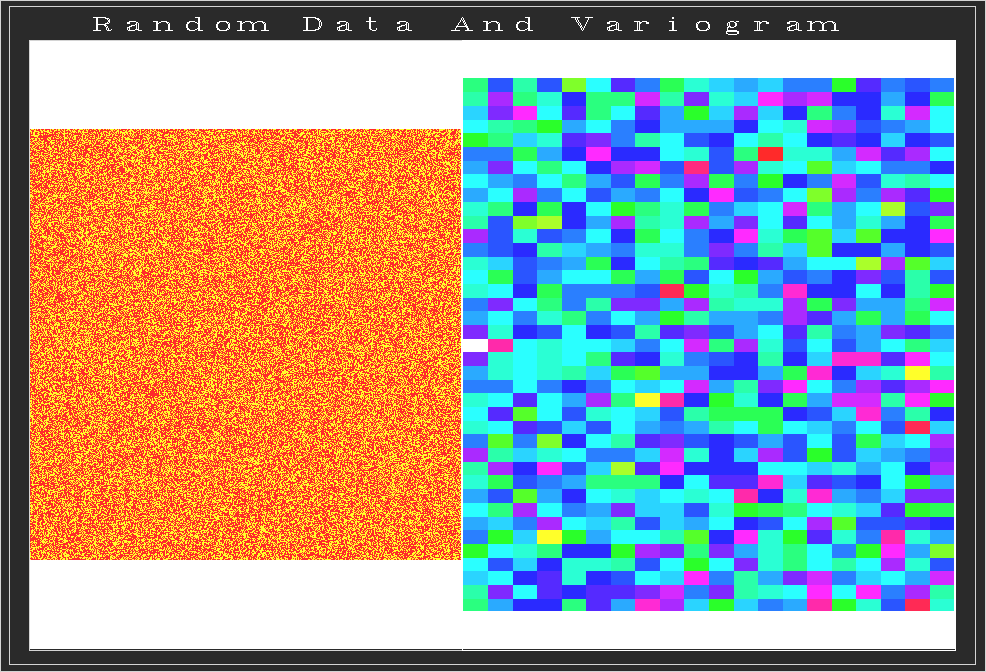 , and one of
 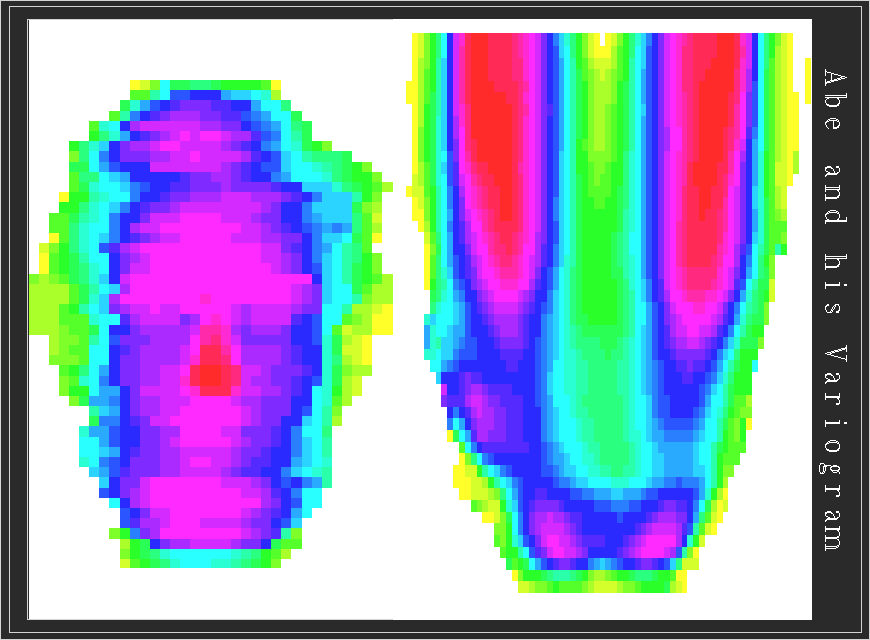 Abe Lincoln's face. Obviously the
random variogram looks random too. In fact, all the values are roughly the
same, which is to say that in inspecting the variogram we find that we can't
trust a close neighbor any more than one at great distance.
Abe Lincoln's face. Obviously the
random variogram looks random too. In fact, all the values are roughly the
same, which is to say that in inspecting the variogram we find that we can't
trust a close neighbor any more than one at great distance.
In the case of Abe, however, we see that the variogram is very smooth. It is zero top-center, and increases from the white to the red (highest values). We trust neighbors more that are located in the yellow and green directions - that is, vertically more than horizontally - as there is more variation in his face in a horizontal direction.
Click  to continue...
 to get back to
the list of exhibitors...
to get back to
the list of exhibitors...