While we may dichotomize models into continuous and discrete, some phenomena can be modelled in either form - as a discrete or continuous model. For example, we can turn cases (discrete) into rates (continuous) which we can map over an area.
"The Poisson process is a mathematical concept and no real phenomenon can be expected to be exactly in accord with it." Cox and Lewis, quoted in "Spatial Processes: models and applications", by Cliff and Ord 1. In spite of that, and as an example problem, we consider the Matui housing data from this excellent book. This is an introduction-by-example to point process modelling; a very practical application of some ideas discussed in one of the principal readings. We reproduce (as well as possible) the analyses done in this paper, which led to certain surprises...!
In any case, remember Pygmalion: don't fall in love with your models: they're just models (and "all models are wrong; some models are useful").
- The Problem:
Matui "suggested that the settlement pattern in the Tonami Plain is essentially one of nucleated villages." Perhaps this means that folks don't build one house: they build a cluster (e.g., I don't come and build by myself, but bring my sister and uncle with me, and they each build a house too). Now the question becomes, how do we test this hypothesis?
- The Data:
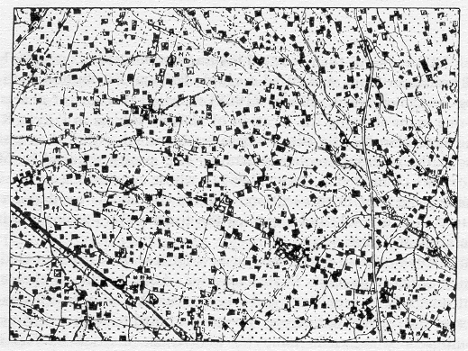
The original paper containing the data was published in the 1930s, meaning that the data was presumably collected on the ground and registered on a map. If we received a paper copy of this data, we have seen how to digitize it, once scanned and turned into an image. We have done this sort of thing in lab.
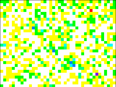
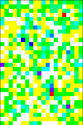
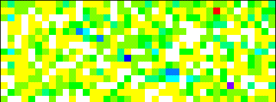
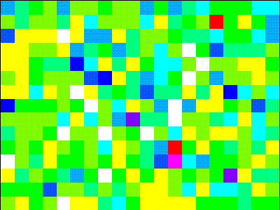
Quadrats: The data was then processed in the following way: house counts are given on 100 meter by 100 meter quadrats. This gridded data is essentially a raster map, which we can analyze in a GIS. If we'd been given the precise locations of the houses on a map, then we could use that data set in a GIS and spatial integration to create the quadrat counts from the sites. Spatial integration is a process whereby we estimate quantities of something -- in this case, numbers of houses -- over an area. [I scanned in the quadrat counts, using OCR (Optical Character Recognition) software, and then verified the scan during an extremely tedious half hour.]
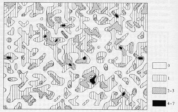
Discrete or continuous? A GRASS GIS contour plot is created from this, representing density of houses per 100 square meters in the area. While Matui's contour plot was painstakingly created from the gridded data, the GRASS contour plot was created quickly from within a GIS, based on the raster data [Compare the two]. The authors don't do anything with Matui's contour map, but it illustrates the possibility of switching from discrete modelling to the continuous modelling (studying density of houses per 100 meter square rather than quadrat counts). A nicer contour plot automatically computed by the data was provided by Cliff Long.
Spatial scale: Because the spatial scale chosen for the quadrats was somewhat arbitrary, we might consolidate the quadrats to create lattices at courser scales: this will allow us to test for effects at various scales. When we turn to the modelling, we may be able to distinguish competing models by applying our techniques at different scales. The authors constructed nine different "lattices" from the original gridded data:
ID t s Lattice
Dimensions# of quadrats Physical Size 1 1 1 30 x 40 1200 100 x 100 2 1 2 30 x 20 600 100 x 200 3 2 1 15 x 40 600 200 x 100 4 2 2 15 x 20 300 200 x 200 5 3 1 10 x 40 400 300 x 100 6 3 2 10 x 20 200 300 x 200 7 1 4 30 x 10 300 100 x 400 8 2 4 15 x 10 150 200 x 400 9 3 4 10 x 10 100 300 x 400 - The Analyses
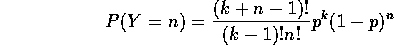
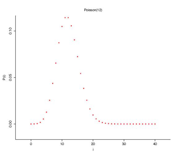
Now the first thing that we might test is something that was discussed briefly in the introductory module: is this set of quadrat counts a sample of a Poisson process? [Who was Poisson?]
The first thing we should do is make sure that everyone is clear on what a Poisson model is: one of my math students once reminded me that a Poisson model is perfect for the number of chocolate chips in chocolate chip cookies: on average each cookie has the same number of chips, but there is certain to be some fluctuation, and this fluctuation would lead to a distribution of chips approximately Poisson.
If the chips possess a Poisson distribution, then, on average, each cookie (representing a fixed ``unit area") has
 chips with a density given by
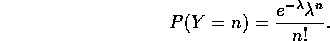
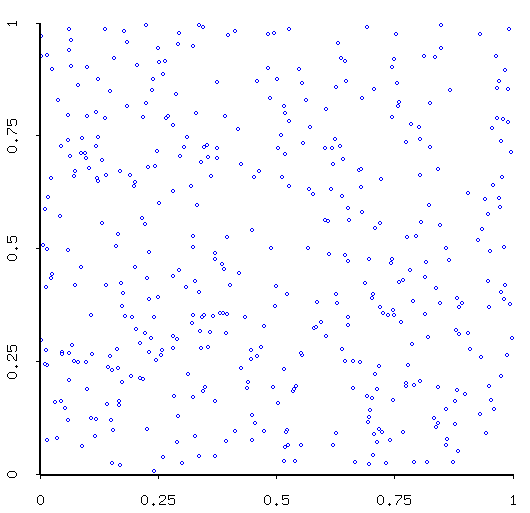
Q: How would you go about generating a simulation of a Poisson process on the unit square?
A: Oh right! Make me tell you....
Assumptions: The Poisson process, as you may already know, is the "standard benchmark for spatial patterns". Two important assumptions of the Poisson process are that- there are no interactions between subareas, and
- there is no tendency for subareas to show similar traits.
Dispersion, d, and
 :
So, are the houses simply scattered over the town at random, like
chocolate chips in cookies? One test that Mark suggested in the
introductory module was to look at the index of dispersion:
:
So, are the houses simply scattered over the town at random, like
chocolate chips in cookies? One test that Mark suggested in the
introductory module was to look at the index of dispersion: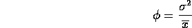
For a Poisson process, this statistic should be 1, since its variance is equal to its mean (both
 ). The statistic
should be N(0,1) for a Poisson process. In the following table, we include the p-values for the
statistic.
ID dispersion d p quadrat 
1 1.172 4.037 7.669 0.053 0.759 2 1.262 4.273 7.336 0.119 1.518 3 1.187 3.105 4.048 0.400 1.518 4 1.353 3.991 11.477 0.075 3.037 5 1.280 3.713 8.648 0.124 2.277 6 1.501 4.492 20.494 0.005 4.555 7 1.320 3.642 6.953 0.325 3.037 8 1.566 4.337 25.664 0.001 6.073 9 1.767 4.634 21.745 0.005 9.110 The index of dispersion and corresponding d statistic reject the Poisson model in every case, while, according to the chi-square test, the Poisson can't be rejected for half of our lattices. [By the way, notice that my chi-squares are not exactly the same as theirs. One reason for this is that it is impossible for me to know how the counts were "binned" (especially for the last two lattices - see table 4.4 for the bins for the Negative Binomial models). Also, the two extreme values of d for lattices 6 and 7 are different in my calculations: these I suspect to be errors on the part of the authors, as all the others were right on. These values also result in more consistent d values across spatial extent.]
Moran's I for SA: In addition to this test of the "Poissonness" of our data, we can also consider the spatial autocorrelation in the data. We do that using a statistic called Moran's I, given by
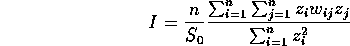
where
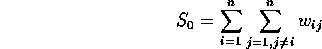
and where z is the mean-centered lattice variable x, while W is the weight matrix, representing the neighbor (or contiguity) relationship between elements of the lattice.
Contiguity: As mentioned once before in class, three types of contiguity are often considered: Rook, Bishop, and Queen. As you can see, however, the matrix W can be huge (if we consider lattice 1, with 1200 points, W is 1200 by 1200). And not only are the W matrices often huge, they're sparse (that is, filled mostly with 0 entries).
Computation: From a computational standpoint, it makes much more sense to just step through the matrix row by row, using the contiguity pattern to compute the product of neighbors, and adding them all up in the end to give the numerator term.
So that's what I did in the following table. We see good agreement here between our results for the I values, but for some strange reason the
 values I calculated are the same as theirs, only
just reversed (Rook -> Queen and vice versa). This changes the "normal
deviates", of course. In any case, as you can see by the p-values, most of
the departures from normality are significant at the 5% level, indicating
spatial autocorrelation. Notice also the trend for the spatial
autocorrelation to fall off as the quadrat size increases.
values I calculated are the same as theirs, only
just reversed (Rook -> Queen and vice versa). This changes the "normal
deviates", of course. In any case, as you can see by the p-values, most of
the departures from normality are significant at the 5% level, indicating
spatial autocorrelation. Notice also the trend for the spatial
autocorrelation to fall off as the quadrat size increases.Standard Deviation: The values of
are given theoretically under the assumption of complete randomization (that
is, there are n! ways of permuting the values, as we compute the standard
deviation of the I statistic assuming that I for all
permutations is computed). Cliff and Ord provide a formula for the
calculation of . Rook's Queen's ID Expected Observed Deviate p Observed Deviate p 1 -0.0008 0.0601 0.0206 2.9170 0.0018 0.0731 0.0147 4.9882 0.0000 2 -0.0017 0.0847 0.0293 2.8907 0.0019 0.0831 0.0209 3.9792 0.0000 3 -0.0017 0.1035 0.0294 3.5257 0.0002 0.0837 0.0209 3.9968 0.0000 4 -0.0033 0.1319 0.0416 3.1684 0.0008 0.0935 0.0297 3.1503 0.0008 5 -0.0025 0.0982 0.0362 2.7155 0.0033 0.0645 0.0259 2.4934 0.0063 6 -0.0050 0.1142 0.0512 2.2310 0.0128 0.0852 0.0365 2.3336 0.0098 7 -0.0033 0.1065 0.0419 2.5437 0.0055 0.0717 0.0299 2.3957 0.0083 8 -0.0067 0.1063 0.0594 1.7898 0.0367 0.0605 0.0423 1.4297 0.0764 9 -0.0101 0.0942 0.0727 1.2947 0.0977 0.0420 0.0517 0.8131 0.2081
These are the Moran's I results for the 9 separate lattices created from the Matui data. I've not been able to discover any error on my part which would result in the sigma values being switched for the queen and rook cases, but they are switched from the book (which also changes the deviate values). The bishop's definition of contiguity was not considered.
Poisson Conclusion: The upshot of the Poisson and SA analysis, according to our authors, is that we can consider that there is some evidence for departure from a Poisson process, and strong evidence for some positive spatial autocorrelation. We now ask how we might model the type of clustering of quadrat values that Matui anticipated in the situation of houses.
- True and Apparent Contagion
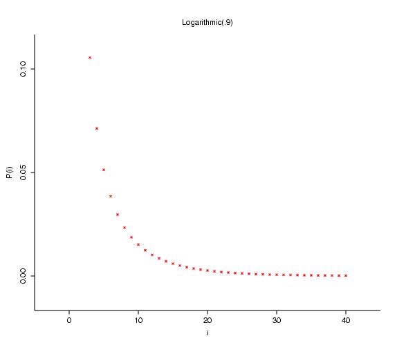
In the reading, Cliff and Ord distinguish between what they call "true" and "apparent" contagion (aka generalized and compound Poisson processes). Let's consider how we might model contagion by Poisson models.
- true contagion: the clusters (each a small point cluster,
whose numbers are distributed according to one of many discrete
distributions) are
distributed according to a Poisson distribution in
the plane, with a fixed parameter . If the number in clusters are given by a logarithmic distribution, then the result is
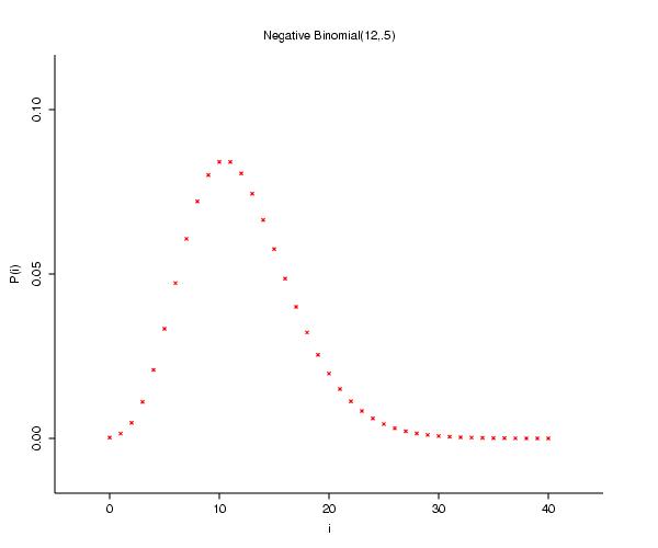
a negative binomial distribution);
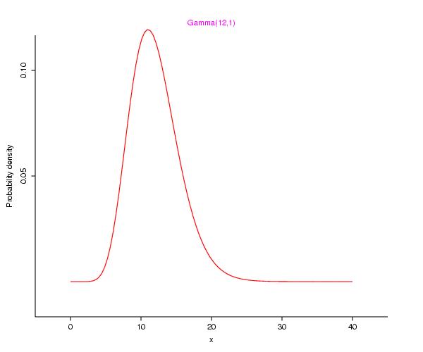
- apparent contagion: the parameter is
a random variable, distributed, perhaps, according to a
gamma distribution (the composition of which
gives rise to a negative binomial distribution of quadrat values). [If you
would like to see how this occurs, refer to
my little but potent note.]
Let's see if we can paraphrase the difference: for true contagion, we reach into a bag, pull out the clusters, and toss them over the plane so that they are a realization of a Poisson Process with fixed
; for apparent contagion, the parameter varies, leading us to see spatial patterns which we
perceive as clusters (or voids) when there is in fact no interaction between
the individuals. The fact that we arrive at a quadrat value distribution that follows a negative binomial distribution,
 ,
,
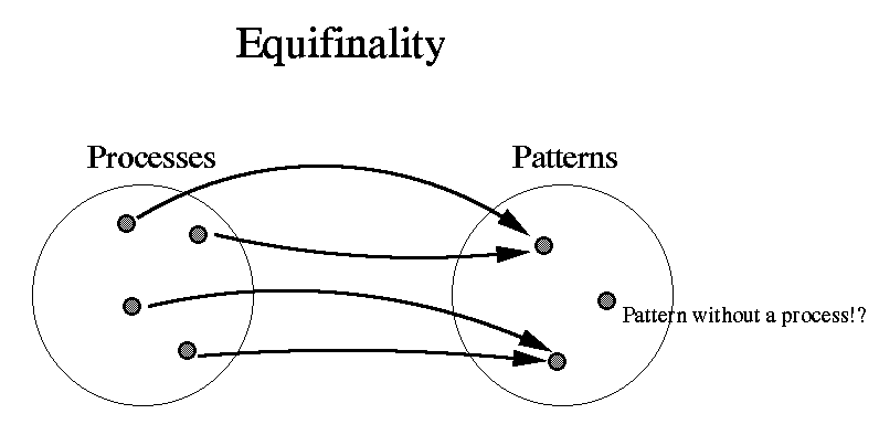
under two completely different assumptions about the process is not particularly unusual. The authors' term for this is equifinality, whereas we mathematicians would say that the function from the space of processes to the space of patterns is not one-to-one. (In fact things could get worse: there may not be a function between the two spaces, as it may be the case that a process maps to several patterns!)
End Run around equifinality:
Cliff and Ord derive the parameters of the negative binomial in terms of the parameters of both types of contagion models. They show that it is possible to distinguish between the two types of processes, if we make some additional assumptions:
- the small clusters of true contagion are much smaller than the quadrat size; and
- the spatial variation of is much larger than
the typical quadrat.
Reaction:
These two assumptions are, in a sense, contradictory: you think to yourself that, as the quadrats get bigger, the first is more likely to be true; but then you realize that the second becomes more likely false! But that's the idea, and another good reason for considering quadrats of different spatial extent.Expected parameters: So we'll play their game. The parameters under the true contagion model should be k=-s
/ln(1- ) and p=; while for the
apparent model, k=b and p=a/(a+s).
) and p=; while for the
apparent model, k=b and p=a/(a+s). ID Parameter p Parameter k chi-square degrees of freedom p value 1 0.868 5 7.029 3 0.071 2 0.798 6 5.981 4 0.201 3 0.856 9 3.696 4 0.449 4 0.767 10 6.227 7 0.514 5 0.798 9 3.559 5 0.614 6 0.687 10 11.780 9 0.226 7 0.767 10 8.332 7 0.304 8 0.644 11 11.168 9 0.264 9 0.588 13 9.343 12 0.673 ), where is the mean
of the data (the MLE of for the
poisson distribution). So while the authors give you two plots, there is
only one plot-worth of information.
Figure 4.3: The plots of the "expected" values in Figure 4.3 are created as follows: the MLEs of the parameters for lattice 1 are used to define the values
, , b and
a. The value of s is computed from the change in spatial
extent: if you examine the quadrat numbers (#) for the
different lattices, you'll see that the k value for the generalized model
(the true contagion) in Figure 4.3(a) rises by 1200/# from the value for
lattice 1. For the parameter p for the apparent contagion in 4.3(b), the p
value falls as a/(a+1200/#)
- true contagion: the clusters (each a small point cluster,
whose numbers are distributed according to one of many discrete
distributions) are
distributed according to a Poisson distribution in
the plane, with a fixed parameter
- Conclusion
Cliff and Ord summarize as follows:
- The negative binomial provides a better fit than the Poisson (which was, in fact, rejected by the index of dispersion).
- The presence of spatial autocorrelation implicates the apparent contagion, rather than the true contagion.
- Afterwords: Centre-Satellite Models
"The compound and generalized Poisson models contain one particularly unrealistic constraint, namely that the `offspring' are coincident with the `parent' - in other words, they suppose that the entire cluster is situated at a single point." Upton and Fingleton, Spatial Data Analysis by Example, p. 16. Thus we add displacement (so-called centre-satellite models - note cool British spelling, since I stole this from those brits):
- Parent events form Poisson forest
- number of offspring generated (via some other distribution, e.g. logarithmic)
- the locations of each offspring displaced relative to parent according to e.g. bivariate normal.
Rates of infection, for example, are often associated with areas (e.g. census blocks). These rates may be interpolated using spatial statistics such as the variogram, creating a continuous representation of the disease rate structure. Oftentimes we will try to model phenomena as a mixture of deterministic and stochastic processes (that is, non-random and random components). This is true in geostatistical techniques, for example, which we will study in more detail in another module. In that case, we formulate a continuous model of the underlying spatial autocorrelation structure, and then use that model to generate an estimate for the values of the variables under study across the region of study.
As an alternative to these, we may develop explicit disease models which incorporate spatial interaction. Geoff Jacquez calls these "models of process", as distinguished from "models of data" (and the knowledge demands required to create such process-based models are much greater than those for data-based models). We have a module dedicated to compartmental models which are models of process; Geoff Jacquez has also created many process-based simulation models, such as this model of rabies in foxes, modelled based upon one of our supplementary readings (Mollison and Kuulasmaa).