- During class time I'll be on Zoom, at https://nku.zoom.us/j/7057440907.
- No labs have been graded yet.
This morning (on Zoom) Kate and I discussed the shape of the logistic curves: this sketch might be helpful. (Thanks for your patience, you students who are helping me get used to Zoom, the iPad, Google Drive, and all this stuff....)
- You have a lab that I had
intended be due today: however I didn't add it to the
assignments page. Please get it to me ASAP. Thanks.
Please, please: put MAT375 (as one word (i.e. not "MAT 375"), as well as assignment info) in the subject line of your message -- I'll be routing all messages using the tag MAT375. It helps.
- Your project-related homework are graded, and should be
returned by class. I'll just email back the pdfs, which I've
marked up.
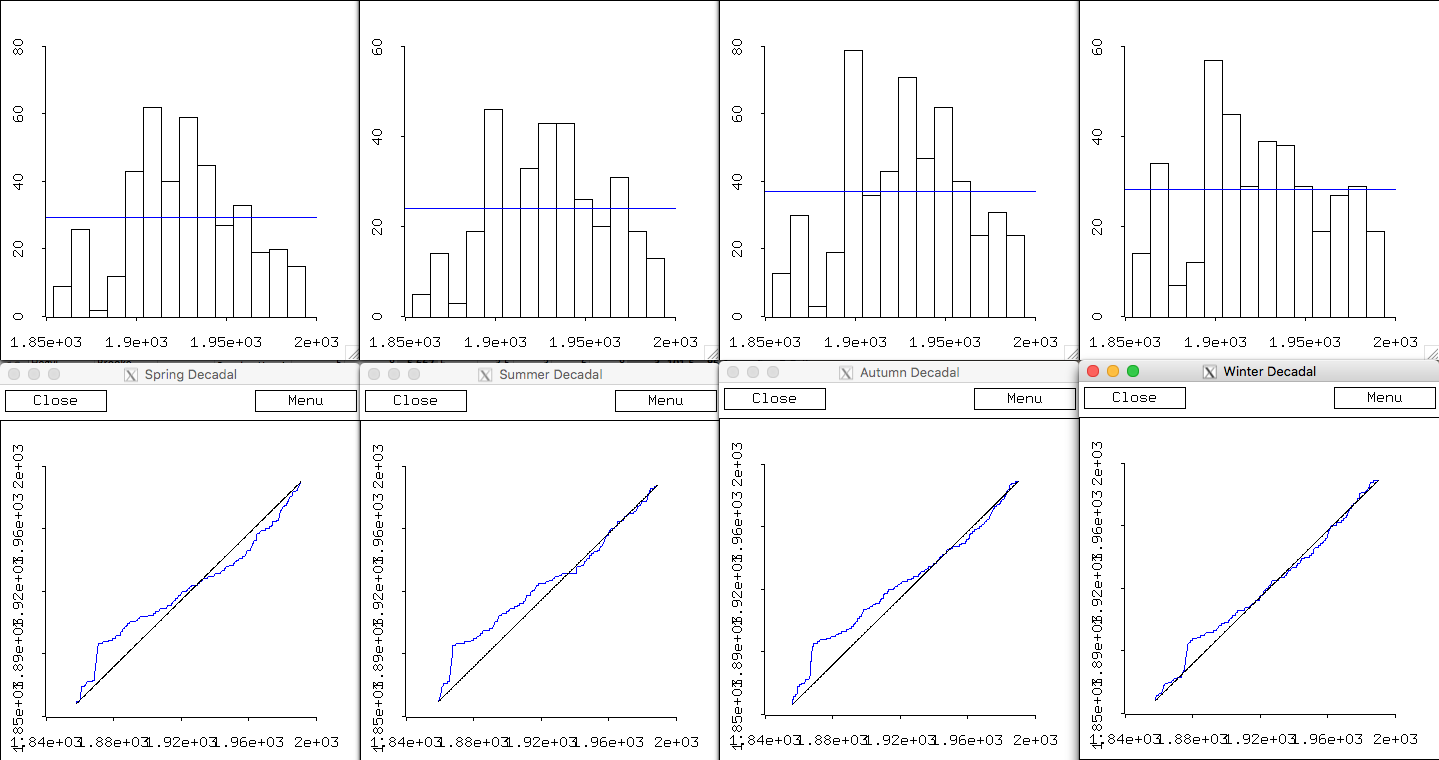
I didn't present the "seasonal" analysis last time, but two students (Jon and Proctor) had a look at the first three months of the year, looking at all extreme years, rather than a single time series of years.
The question is a little different, but the answer should be the same: if all decades are "equivalent", then we should see a uniform distribution of extremes per decade across the three months.
Jon and Proctor looked at the first three months of the year, which should give results very close to "Winter", below. In what follows I divy things up into the actual seasons (e.g. Dec 21-March 21, etc.).
- Seasons:
Spring, Summer, Autumn, Winter 
I've added a "uniform" bar to each histogram - to show what bin height you'd expect in the absence of any change over decades (it's really just the average bin height). Once again, we note the paucity of extreme years in the first four decades which we saw in the previous plots for each of the four extreme temperature readings' years.
-
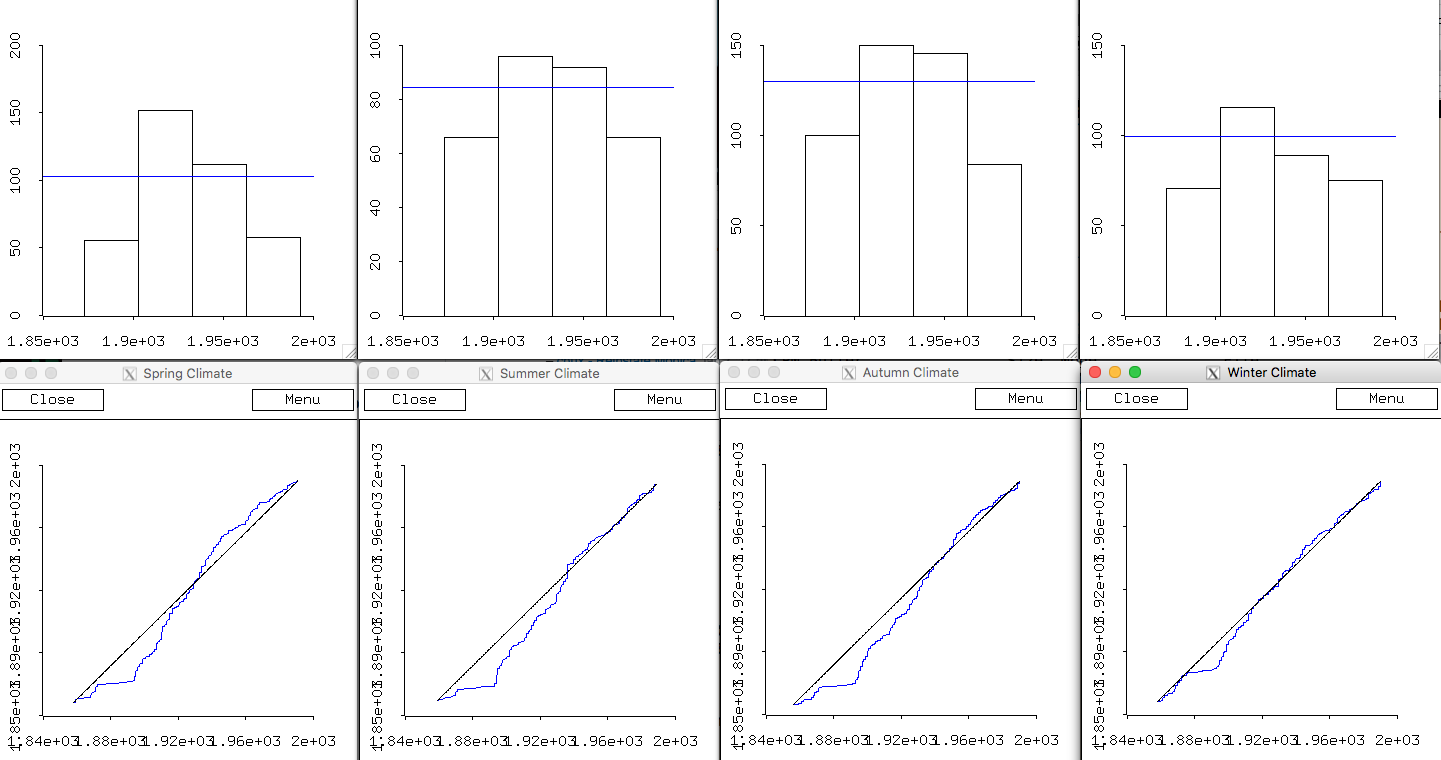
Spring, Summer, Autumn, Winter 
I've added a "uniform" bar to each histogram - to show what bin height you'd expect in the absence of any change over decades (it's really just the average bin height). I want to emphasize again, after grading your homework and seeing folks talk about how "normal" the histograms look, the following: that
we don't expect normal distributions -- not at all! There's nothing special about the middle decades. They should be just as high as any others.
Notice that I've changed (reflected) the bottom plots, to better perceive the "direction" of the fit (or lack of fit) to a uniform distribution. I've made the empirical results look low -- lower than the straight line of the uniform distribution -- when there is a lack of data for a period.
- I'm ready to say that we should reject the null of a
uniform decadal distribution, as well as a null for uniform
distribution for the four thirty-year climate periods (1873,
1903, 1933, and 1963-1992).
That means that we're asserting that climate has changed over the 138 years from 1854 to 1992 (even though we're suspicious of the validity of earlier data).
It turns out that there is good reason to be suspicious of the earlier data. More on that later....
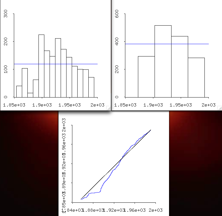
- I think that we might take a different approach to the
question now, as to how climate is changing. If we
benchmark the time series to all of the data, we can make some
relative comparisons -- that might be interesting. Here
is all of the data, graphed decadally, as well as by 30-year climate
groupings starting 1873, 1903, 1933, and 1963-1992.

- Seasons:
- You carried out a lab designed to introduce you to the Lotka-Volterra system of predator/prey.
- I had planned to have you do a third lab, but I'm going to ask you
to do a little reading for our major project instead. So I'm
borrowing a day from the future, and I'll push back our third
and final "predator/prey" lab until Monday.
- First off, please read and try to understand what I've written above (and for last class) about our expectations, and how the data is looking. That is what motivated the following two readings.
- I'd like you to read
Fletcher's
descriptions of the decades relevant to our data
set. (You'll notice that some of the pages were out of order --
I wish that he'd have had me read it before publication, so I
could have fixed that. Then maybe it would have been a best seller...!:)
Upon inspection of the graphs above (and those from our previous day's agenda), I went to Lyle Fletcher to see if he would reveal anything that could explain the graphs we're getting. He was cavorting with the angels, but took a few moments out to speak with me (through his book).
If you do this reading, you'll understand my cryptic remark "good reason to be suspicious" above. Email me the answer, to let me know that you're on to it. Careful reading will reveal the issue.
- The second reading is about our expectations of the impacts of
climate change. This, too, was motivated by the graphics (and
their failure to agree with my expectations!:).
You may choose any paper from this conference proceedings ( Asymetric Change of Daily Temperature Range, Proceedings of the International MINIMAX WORKSHOP Held Under the Auspices of NOAA National Environmental Watch and the DOE Global Change Research Program).
Please submit a (typed) two-page "book report" about the implications of what we might expect to see in our maximum and minimum temperature data, based on what others have seen due to climate change. Base your conclusions on what you've read in your chosen article (due Monday, 3/30).
- If you want to get ahead, our next (and final) mini-project will
be to work on SIR (Susceptible/Infected/Recovered) models of
disease. We're obviously a little more interested in those at the
moment. We'll be adding Death to the models, unfortunately (SIRD
models)....
Some good links that I might recommend (a few of which we'll focus on):
- A great intro to many of the most important question: "When a new virus emerges, no one is immune. A highly transmissible virus, like the coronavirus behind the current pandemic, can spread like wildfire, quickly burning through the dry kindling of a totally naive population. But once enough people are immune, the virus runs into walls of immunity, and the pandemic peters out instead of raging ahead. Scientists call that the herd immunity threshold."
- How
epidemics like covid-19 end (and how to end them faster): A
coronavirus causing a disease called covid-19 has infected more than
70,000 people since it was first reported in late 2019. To predict how
big the epidemic could get, researchers are working to determine how
contagious the virus is.
- The SIR Model for Spread of Disease - Introduction (from the MAA).
In particular, we will implement The SIR Model for Spread of Disease - The Differential Equation Model in InsightMaker.
- Mathematics
of the Corona outbreak, with Professor Tim Britton
(An excellent introduction to SIR models, from both the infectious disease and mathematical sides)
Questions:
- Where is the "calculus moment" in this video?
- How does Britton suggest breaking $R_0$ down into "actionable" pieces?
- This Covid-19 situation is probably more suited to a SIRDs model (with disease-induced death).
- An on-line
model developed by Ashleigh Tuite and David Fisman, Dalla Lana
School of Public Health, University of Toronto
- This one incorporates space into the model. These models are called "agent-based models".
- Could
Coronavirus Cause as Many Deaths as Cancer in the U.S.? Putting
Estimates in Context
This on-line estimator (i.e., a model!) allows one to estimate deaths, as well as death by age-category.
- A nice R-based introduction to infectious diseases and nonlinear differential equations.
- Use of a log-scale (which they take pains to explain) to illustrate deaths by country, updated daily. There is even a separate page at the New York Times to explain log plots: "A Different Way to Chart the Spread of Coronavirus: Those skyrocketing curves tell an alarming story. But logarithmic graphs can help reveal when the pandemic begins to slow."
- The Bestiary of functions, from Ben Bolker's Ecological Models and Data in R
- My "DEs in a Day" page.
- Mathematica version of the Tyson, et al. basic model