-
During class time I'll be on Zoom, at
https://nku.zoom.us/j/7057440907.
- An important word on Pass/Fail from
our chair, Dr. Buckley.
- I highlight, in bold, the important piece which the university isn't highlighting in the FAQ for students....
- No new homework.
- Your last homework is graded, but I'm calling it "extra
credit". Some of you didn't do it, and some of you didn't know
what in the heck I was talking about. So anyone who submitted
something gets a 10/10. Samuel's submission comes
closest to what I had in mind. Nice work, Samuel!
Samuel, Silas, and other found that temperatures are rising a degree or so over a century. It doesn't sound like much, but all our land-based ice melting (with disastrous consequences such as flooding, sea-level rise, loss of freshwater sources, no more hydro power, etc.).
I've already said that I wished you all had just said "Hey, what the heck are you talking about?" -- well, before midnight of the day it was due, which is when I got about three emails.... :)
- Our final:
- Our final is Monday, which I'll make available at 8:00. There will be a shorter (shouldn't take two hours) "in-class" portion, which you will send back to me (by noon -- but take no more than two hours); and then there will be a "take-home" portion, due Friday (involving a little regression and InsightMaker).
- First of all, I wanted you to look for outliers in the data. Even
though this BG data comes from NOAA, and you'd expect it to be
clean, you might be surprised at what you can find.
So if you did check out 3/8/47 in the data as it arrived from NOAA, and those others, you might have noticed that they have negative DTRs (Diurnal Temperature Range - which explains how they were discovered). The DTR isn't reported by NOAA, so I'd computed that and noticed something that shouldn't happen: one of the number one rules is that you shouldn't have a min greater than a max!
If I get really ambitious, I might email NOAA to let them know about the errors in their database. That would be a good thing to do, to help them clean up. We'll see if I get a round tuit... for Christmas.
So we try to find anything like this -- obvious data errors -- which will cause trouble for our analysis. And them we fix them.
- Now at this stage in my analysis I turned to the software program
R (a public domain statistical software package), using RStudio as the
environment in which to do my work. That's because there's a lovely
package called "gstat"
which allows me to do the simulations.
I don't have any other software for doing that at the moment, so this was a necessary labor.
It has been quite the labor of love -- no, not love, but rather pain -- to get gstat to do what I wanted. When you're working with different software packages, stuff happens. For example, I define a Gaussian variogram as \[ \gamma(h)=1.0 - e^{-\ln(20)\left(\frac{h}{r}\right)^2}; \] Gstat defines it as \[ \gamma(h)=1.0 - e^{-\left(\frac{h}{r}\right)^2}. \] I had to download the source code for gstat (which is public domain, thankfully) to discover that. But, in the end, we're getting along.
Another important trick, however: gstat is designed for spatial data, so it assumes two spatial dimensions -- so I created a constant coordinate to add to time, to trick it: $(1,1), (2,1), (3,1), \ldots, (45782,1)$.
Many statisticians don't know about variograms, and those who do associate them with mining and such -- spatial problems. But it works just fine for time series.
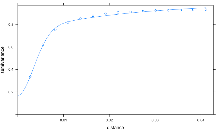
I used R to compute the empirical variogram, and (attempted) to let gstat fit a model -- but it didn't do non-linear regression as well as other software I use (I used xlispstat, but Mathematica does fine), so I did that myself and handed the variogram to gstat. Now that we agree on definitions, the pictures from gstat show variograms fitting the data a whole lot better (the "x" axis is actually "distance in years" -- so we're looking at data spaced by days):
So if we're going to simulate a temperature (let's say a min), you
- Standardize the data, creating $Zmin$ as
\[
Zmin(t)=\frac{min(t)-MinMean(t)}{MinSD(t)}
\]
where $MinMean(t)$ and $MinSD(t)$ (annual graphs of both
feature in this figure: left side -- Maxes on the right):
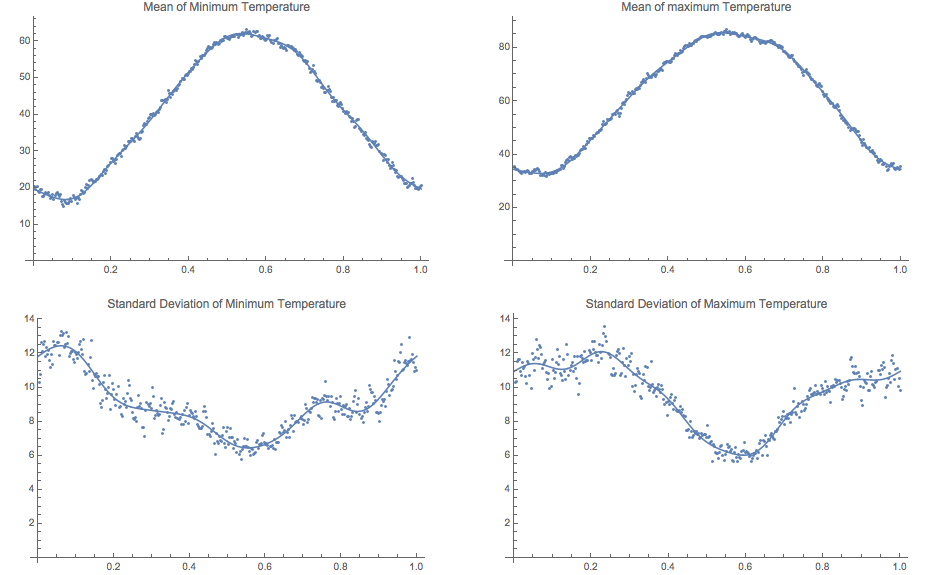
Again, these were computed by linear regression using trig functions that are 1-year periodic. In the end I wanted periodic mean and sd functions, so that was important.
A null hypothesis of "no climate change" means that we have the same means and standard deviations year after year.
So instead of just $\cos(2\pi t)$ and $\sin(2\pi t)$, I added pairs using $4\pi, 6\pi, 8\pi, 10\pi, 12\pi$ to compute the trend models underneath the data. - Compute the empirical variogram for $Zmin$ (standardized
minimum temperature, over 127 years!).
- Model the empirical variogram with a theoretical variogram
(and again, just to emphasize: this is a non-linear regression
problem, with a family of functions -- such as that Gaussian
model above -- that have properties essential for the job of
modeling what is a temporal decomposition of the
variance in the data).
- Pass that model to gstat for the purpose of simulation.
- Have it generate simulations on the same dates that we
have for our data, which have the same temporal
autocorrelation structure as $Zmin$ (both are below):
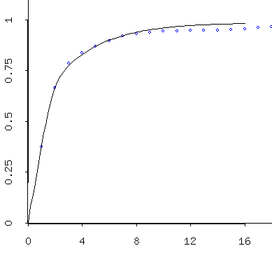
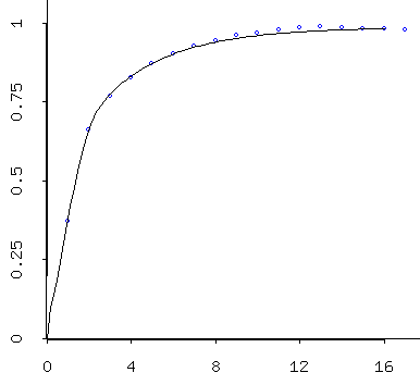
Variogram for the $Zmin$ data Variogram for the simulated data - Un-Standardize the data, creating $Smin$ by
undoing what we did to create $Zmin$, but on the
simulated data $simZmin$:
\[
Smin(t)= MinMean(t) + MinSD(t) simZmin(t)
\]
where $t$ is time in years from 0 to 127 or so (and remember
that $MinMean(t)$ and $MinSD(t)$ are periodic function of
year).
This is the same process you use in your statistics class, when you transform a normal variate to a standard normal variate: \[ z=\frac{y-\mu}{\sigma} \] then, at the end, you may un-transform back, via \[ y=\mu + \sigma z \]
- Associate the years with this data set, as though it were
"Bowling Green temperatures" (like that provided by
NOAA).
Here's the result of regressing the simulated minima and the actual minima against $\sin(2 \pi t)$ and $\cos(2 \pi t)$:
(and, by the way, my results will be slightly different from yours, unless you too removed some erroneous data -- maybe you found some more erroneous data to remove...!:)
Linear Regression:        Estimate            SE              Prob

Constant                 40.0818        (4.257565E-2)       0.00000
cos(2 pi t)              -20.4231       (6.012267E-2)       0.00000
sin(2 pi t)              -8.29364       (6.029912E-2)       0.00000

R Squared:               0.746108
Sigma hat:               9.10964
Number of cases:             45782
Degrees of freedom:          45779
simulated minima $Smin$: Mean: 40.017
SD: 18.079
Linear Regression:        Estimate            SE              Prob

Constant                 40.0546        (4.318030E-2)       0.00000
cos(2 pi t)              -20.9435       (6.097651E-2)       0.00000
sin(2 pi t)              -7.24789       (6.115547E-2)       0.00000

R Squared:               0.742800
Sigma hat:               9.23901
Number of cases:             45782
Degrees of freedom:          45779
actual minima Mean: 39.993
SD: 18.217
Linear Regression:        Estimate            SE              Prob

Constant                 60.6425        (4.549809E-2)       0.00000
cos(2 pi t)              -24.7985       (6.424956E-2)       0.00000
sin(2 pi t)              -9.12010       (6.443812E-2)       0.00000

R Squared:               0.787120
Sigma hat:               9.73493
Number of cases:             45782
Degrees of freedom:          45779
simulated maxima $Smax$: Mean: 60.567
SD: 21.099
Linear Regression:        Estimate            SE              Prob

Constant                 60.6009        (4.605287E-2)       0.00000
cos(2 pi t)              -25.3769       (6.503299E-2)       0.00000
sin(2 pi t)              -7.87640       (6.522385E-2)       0.00000

R Squared:               0.784930
Sigma hat:               9.85363
Number of cases:             45782
Degrees of freedom:          45779
actual maxima Mean: 60.530
SD: 21.247
- Compute the extreme year data (i.e. the "Fletcher
data"). That is, for each day of the year find the years for
which the most extreme temperatures (minmin, etc.)
occurred. Include ties.
- Now do it 1000 times.... (Simulation)
- Compare the Fletcher data to the range of possible
distributions obtained by simulation, to see how likely
(or unlikely) it would be, assuming no climate
change (which is how the simulations are made -- with
"stationary" climate).
(Because our model has no climate change in it: the same means and standard deviations repeat year after year....)
- Standardize the data, creating $Zmin$ as
\[
Zmin(t)=\frac{min(t)-MinMean(t)}{MinSD(t)}
\]
where $MinMean(t)$ and $MinSD(t)$ (annual graphs of both
feature in this figure: left side -- Maxes on the right):
- I've got some pictures to show! It took a bit of doing, but
fortunately everything came together. These are the kinds of
puzzles that I really love, so it wasn't too bad.
But, to be honest, you've got to love banging your head against a wall...:)
After the "picture show" I'll make a few comments about the final exam material.
- Which of the three panels is "not like the others"? One is the
Fletcher data, but which one?
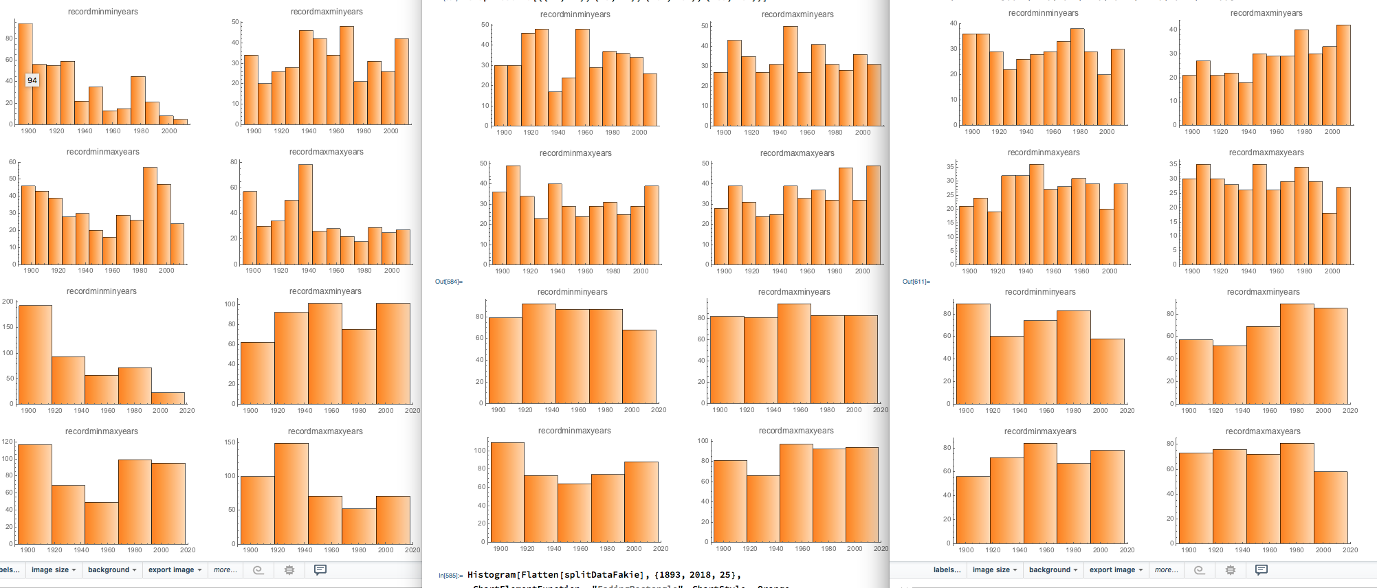
The other two are simulations, with the same temporal autocorrelation (or pretty close) -- that is, the simulated data has the same variogram -- with each simulation producing its own versions of the Fletcher data.
(If you guessed that Fletcher's was the one on the left, I'm grateful!)
- Variograms for the simulated data produced by gstat, via RStudio:
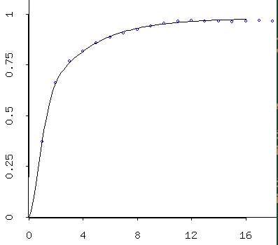
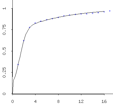
Simulated data (mins) follows a beautiful variogram model. Simulated data (maxes) also follows a beautiful -- and slightly different -- variogram model. Because these are simulated, they're a little better behaved than the empirical/theoretical variograms we obtained from the data. As I described last time, one interprets the models. So these models suggest that temperatures are correlated well over only a few days, then the correlation falls off to "background" levels after about 10 days. By three days they're at about 75% of the background variance; so by then they've already lost alot of their similarity to a given day. I would say that basically these indicate that you can expect today's temps to tell you roughly what tomorrow's will be, maybe the next day's, too -- but after that, it gets tricky...:)
- So the question becomes this: is it clear from the simulated data
that Fletcher's data was "out of line", assuming no climate
change?
Here's a very preliminary answer (again, using only two simulations):
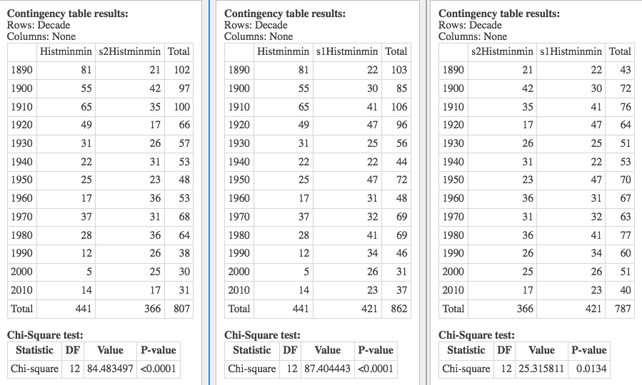
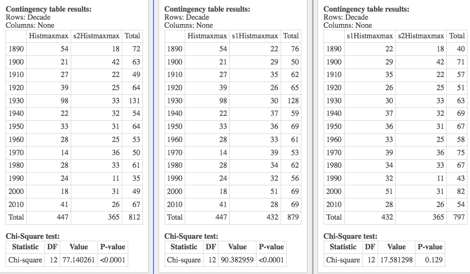
In this graphic we look at the chi-square test of independence, to tell if there's any relationship between decade and a pair of variables -- either the Fletcher and Sim1, Fletcher and Sim2, or Sim1 and Sim2.
As you can see from the results, the Fletcher data is much different from the others.
Here (below) I compare a simulated minmin with a uniform distribution across the decades, and the chi-square says that there's independence between the decades and these -- i.e. that the simulation is essentially uniform. But let's start with the "whoops":
Whoops! I noticed the rather strange number of days in the simulation above (366), and discovered that when that simulation was conducted I was not rounding the temperatures produced (the simulation from gstat doesn't care that they be integers, but data from NOAA is rounded). So the following has to be taken with a grain of salt!What "failure to round" means is that there were unlikely to be ties, so there were exactly 366 extreme years. That was very unlikely given the other simulation results, and so I swooped in. And now I know the reason for that. But I still don't know the reason for one of the data sets having only 365 extreme years (see the results below)...!...:)
This illustrates the importance of carefully examining everything for errors, and why it's important to have collaborators who check each others' work.
Let's look over the one below, and then I'll just show you the others with a little commentary. I'm doing a $\chi^2$ test for independence -- meaning there's no relationship between decade and these variables.
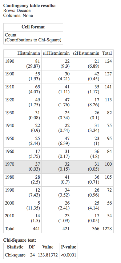
And that null is rejected: there is a relationship. (In fact, minmin was our most dramatic departure from uniformity, based on the histogram).
So I look at the results pair-wise in the following graphic, to determine which pair is "causing the problem", and conclude that the Fletcher results are really quite unlike the simulation results.

The other three variables are featured here below (with the grain of salt that one of the simulations should have been rounded, and wasn't). So these are some preliminary results. But they show the idea -- what we're trying to accomplish: that Fletcher's results are unlike results obtained assuming no climate change -- and so they are the result of something else.
The "something" could be error; or it could be bad luck; or it could be climate change. Only God knows for sure. But as scientists, we present the most likely hypothesis, and conclude that Fletcher's data is most consistent with an hypothesis of climate change in Wood County.


- One final mission, which I haven't gotten to yet. The next step
would be to include our "with climate change" model
(i.e. include the linear term in the regressions for the
minimum).
If we were lucky (blessed, etc) the simulations we generate with that might be indistinguishable from Fletcher's work, which would add credibility to our model. But it would also suggest that climate change is indeed occurring, which is sad.... And I assure you that it is occurring, and we're not preparing in the least.
- Whew! So there's the Fletcher summary. I wish that we'd had more
chance to get there "together".
Let's review briefly our journey this semester. The major themes are linear and non-linear modeling, with a focus on projects to guide us to the use of various techniques.
- Thad and Thomas's Cross-Country problem
- Featuring Riegel's linearizable (power) model.
- Dave's Stick
- Featuring quadratic (straight linear) models.
- The Fletcher project
- Featuring structural modeling, such as periodic oscillations, modeling of variance;
- Simulation
- Hypothesis testing: $\chi^2$ tests (or similar, including just visual inspection of histograms) to determine if Fletcher's data suggests a deviation from uniformity indicative of climate change.
- Hare and Lynx: the Tyson data
- Featuring Differential Equations (DEs), especially logistic growth of a prey, and mass-action interaction of predator and prey.
- SIR models of infectious disease: Covid-19
- Featuring flattening the curve with isolation and quarantine.
- Linear Regression
- "Linear" means "Linear in the parameters"
- Derivation: Multivariate calculus
- Derivation: Linear algebra
- Diagnostics (residuals, p-values, CI) -- don't fit
a banana with a straight line
By the way, some of you are using "significant" in an entirely un-statistical sense. The p-value in a typical regression represents the probability that a parameter is "different from 0". So some of you should say "significantly different from 0" (rather than "significant").
Some of you seem to be using "significant" as a synonym for "important".
- Linearizing the non-linear
- Empirical versus Structural Modeling
- Modeling period phenomena with sines and cosines
- Non-linear Regression
- Derivation (we can do non-linear regression as iterations of linear regression)
- Diagnostics (don't use $R^2$!)
- Compare to linear, and focus on similar reporting (e.g. residuals, MSE -- mean square error)
- Differential equations
- Simple examples:
- exponential growth
- logistic growth
- SIR "compartmental" models, with mass-action
dynamics (two things have to encounter each
other, leading to product terms in the DE).
- Sadly, these models are all-too relevant today. I hope that you appreciated some of the implications of our modeling for the coronavirus outbreak.
- If we flatten the curve too hard at first,
and then release, we'll get a big spike
later. The politicians are ignoring
this.
The scientists and mathematicians know this. "The politicians" are counting on miraculous cures and vaccines that do not yet exist. Or other miracles. That's not a sane policy, but then some of our politicians aren't sane....
- In both cases, we used InsightMaker to
create simulations of diseases or ecological
models. These help us to "battle test" our
ideas, to see if they're giving the proper
qualitative results.
In the case of the Covid-19 model of Italy, we could attempt to match the data, and make predictions for the number of cases and deaths.
- Predator Prey
- See above
- Simple examples:
- Thad and Thomas's Cross-Country problem
- My main goal in this course is to illustrate how mathematical
models can be applied to real problems. I hope that that
has come through over the course of the semester.
I'm sorry that a real-life SIR had to so dramatically alter our course, but I hope that it drives home the very importance of our work, and perhaps shows you how we can apply these ideas and techniques in our lives -- hopefully to improve them.
- The Bestiary of functions, from Ben Bolker's Ecological Models and Data in R