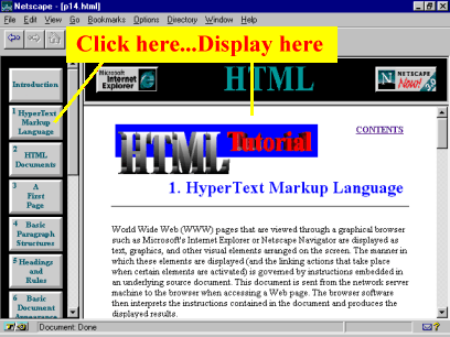
Frames divide a web page into multiple, scrollable regions in which you can have multiple pages displayed at the same time. Very often there are three main types of frames: a header that contains an identifying logo, an advertiser's strip, or other constant information that doesn't change; a menu frame that permits the user to navigate among the pages of the web; and a document frame where the various pages are displayed. If this present web were to be viewed in frames, it might look like Figure 14-1. Figure 14-1. View of the present web in a frames-capable browser.

As a matter of fact, this web is viewable in frames, and you can view this page and others by
switching to it. GO FRAMES!
<HTML>
The <FRAMESET> section would be coded something like the following:
<FRAMESET COLS="20%,80%">
<FRAMESET COLS="20%,80%">
The next line <FRAME SRC="frame1.html"> identifies which HTML document will be displayed in the first column frame:
<FRAMESET COLS="20%,80%">
The next section describes the second column. In this case it is divided into two
frames (or rows)--one sized 20% of the column, the other 80%. The first (top) row will be used to
display a page named "frame2.html," the second (bottom) row will be used to display page
"frame3.html."
<FRAMESET COLS="20%,80%">
Notice that the description for the bottom-right frame includes an assigned name in addition to
the name of the source document that initially appears in the frame:
NAME="frame3". The reason for the name is that this frame
will be a "target" frame to display the contents of multiple pages. Documents sent to a frame
named "frame3" will display in this frame. In contrast, neither of the other two frames have names.
This is because only one document--the original source document--will be displayed in each of
these.
<FRAME SRC="frame1.html">
denote that the documents "frame1.html" and "frame2.html" will be displayed in the associated
frames. The third case is that the tag
<FRAME SRC="frame3.html" NAME="frame3">
denotes that document "frame3.html" will initially populated the third frame; however, it was assigned
a target name that can be referred to when wanting to put other documents there.
Assume for the moment that your "frame1.html" document is a menu bar. Within this document are
buttons that will display down column 1 of the browser window. When any one of the buttons is
clicked, you want the associated page displayed in the third frame. Figure 14-2, taken from the
previous illustration, shows this arrangement of frames
Figure 14-2. When the user clicks on one of the buttons in the left frame, the associated page is
displayed in the bottom-right frame.

The "frame1.html" document appearing in the left column contains a series of graphic anchors, each pointing to the "frame3" target. The general format of these anchors is: <A HREF="document.html" TARGET="frame3"><IMG SRC="button image"></A> where the TARGET parameter of the anchor tag refers to the name of the frame where the document.html will appear when the user clicks on the button image. There will be as many of these statements as there are buttons, each pointing to "frame3" as the TARGET. You can use as many frames as is practical, all or none of which have dynamic content controlled from other frames. If you do not utilize target frames, then the contents of any one frame changes just as in the full-window version of a page. Each frame would work independently of the others. As you're designing frames, make sure to keep in mind some potential drawbacks. First, the average size of computer screens make it impractical to employ more than two to four frames. Beyond that, screens tend to get cluttered, making the user more cognizant of the machinations of the frames than of their content. Second, avoid a lot of interdependence among frames (the user clicks in frame 1 to call up a menu in frame 2 which displays a document in frame 3 that automatically reloads frame 1 triggering frames 2 and 3 to exchange pages spilling the contents on the keyboard!). Third, many independent frames permit the user to scurry off in many directions at once, possibly missing the point of the structure of your presentation. Sometimes its best to control the exposure of your material so the user sees it in a related, understandable fashion.
| |
