Block level element #1 (h1)
Block level element #2 (h2)
Block level element #3 (p) Humpty dumpty sat on a wall. Humpty Dumpty had a great fall.
This page introduces terms and techniques for positioning HTML elements with CSS. The information here can be used for entire page layouts.
“Every element on a web page is surrounded by a force field — a simple, multi-layered box that can be manipulated to create sophisticated effects.” —Griffiths
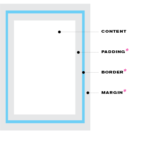
This diagram shows an exaggerated view of the zones surrounding every html element such as a heading, a box with text and/or images in it, a box with navigation, etc. By default, they are invisible, but each side individually can be styled or made to create space between elements.
content This is the viewable text, images, movies, etc. inside of html ‘containers.’
padding This is an invisible interior margin; it’s space inside of the border. Can be small or big.
border This is the outline of a box. It can be visible/invisible. To give it a value is to create an outline around a box. For a border to appear, a border's width, color and style have to be specified in the css.
margin This is an invisible exterior margin; it’s space outside of the border. Can be small or big.
HTML elements can be customized with the use of class and ID selectors in css. They are a common way to achieve large-scale design customization and visual uniqueness. Without them, you’re limited to a finite set of pre-existing tags.
class selectors (.) A class is another type of unique name you can give to an html element. Styles can be applied to these html elements with a corresponding CSS selector; to style an html element with an class in CSS, put a “.” (a period) in front of the selector’s name. HTML classes can be re-used repeatedly a given page, and across many pages of a site.
id selectors (#) An ID is a unique name given to an html element. Styles can be applied to these html elements with a corresponding CSS selector; to style an html element with an ID in CSS, put a “#” sign in front of the selector’s name. HTML IDs can only be used on one type of element on a given page, but they can be repeated across many pages of a site.
block-level elements These are chunks of information that get rendered with space after them by default. Common examples are: h1–h6 tags, p tags and div tags.
div tag A div tag is a block-level element found in html. It is used to mark up a ‘division‘ or section of information so that it can be presented together; and/or, it can be used to separate chunks of information. Using div tags aids in layout because you can give them specific placement on a page.
span tags An inline element found in html: used to mark up content within a block-level element.
static/normal flow By default, all html block level elements appear vertically in the order that they’re typed in the html — one beneath the other, as a stack. This is called static positioning, or, more commonly, “normal flow.” Example:
Block level element #3 (p) Humpty dumpty sat on a wall. Humpty Dumpty had a great fall.
absolute This type of positioning removes an item from its place in normal flow and orients it in relation to the top-left corner of its parent element. Used in cases of items that need to “piggy-back” onto other items. Examples:
Block level element #3
Block level element #3
fixed A form of absolute positioning that pulls an element out of normal flow and attaches it in relation to the edges of the browser window itself. Doesn’t affect other elements’ positions and stays put, or “fixed,” to the browser frame even when the user scrolls up/down the page. Used frequently for navigation and other instances when an item needs to stay visible in spite of scrolling. The pink box on this page that says, “View the site’s external css” is an example of an element with fixed positioning.
float A form of placement that allows elements to appear side-by-side. Can be used to put elements next to each other, or to wrap text around images or other elements. It used to be used to construct entire page layouts.
Block level element #3 (p). Humpty dumpty sat on a wall. Humpty Dumpty had a great fall.
In this case, the image is set to float to the left, which allows the text to wrap around the right side of the image.
relative This type of positioning moves an element from its position in normal flow and offsets it relative to where it *would* have been in normal flow (versus relative to its parent container, as in the case of absolute positioning). Position: relative; is sometimes set as a condition to allow other things to occur; for example, to be able to have child elements that can float, or to be able to control the z-index of an child element.
Block level element #3 (p) Humpty dumpty sat on a wall. Humpty Dumpty had a great fall.
flex box One-dimensional layout control; that is, good for horizontal *or* vertical positioning. Can be a good alternative to floats. The parent element is set as the flex container; child elements become flex items. Works well in combination with css grid techniques described below.
Element #3
css grid Two-dimensional layout control that enables horizontal *and* vertical organization of elements across a true grid. Enormous layout flexibility and much less code than past methods. A parent element is the grid container; child elements of that parent are grid items. A strongly recommended layout technique, along with flex box, above.
Element #1
Element #2
Element #3
Element #4
Element #5
Element #6
z-index The place an element occupies in the layering order/depth of elements on the page (“stacking order”). Elements can be layered on top of each other and pushed back — or brought forward — with the z-index value. The higher the number, the closer to the viewer/user an element is (i.e., a z-index of 1 would push an element all the way to the back of all elements in the page).
Element #3