-
During class time I'll be on Zoom, at https://nku.zoom.us/j/7057440907.
-
I've graded your second lab, and I've produced a "key" for it (although note that I was
lazy, and didn't bother changing foxes to lynx). There was one hiccup
in it, where I could have told you more, and gotten better results. My
bad. So I took that into account when grading.
- I've looked at (but haven't finished grading) your "book
reports". The following papers were chosen from the collection
Asymetric Change of Daily Temperature Range, Proceedings of the
International MINIMAX WORKSHOP Held Under the Auspices of
NOAA National Environmental Watch and the DOE Global Change
Research Program)
- MINIMAX Workshop Summary
G. Kukla, T. Karl, M. Riches
- (p. 1): Maximum and minimum temperatures: A backward and a forward look
D. E. Parker
- (p. 13): The effect of artificial discontinuities on recent trends in minimum and maximum temperatures
D. R. Easterling, T.C. Peterson
- (p. 161): The climate record: Charleston, South Carolina 1738-1991
DJ. Smith
- (p. 231): Cloudiness trends this century from surface observations (Abstract)
K. McGuffie, A. Henderson-Sellers
- (p. 327): DTR and cloud cover in the Nordic Countries: Observed trends and estimates for the future
E. Kaas, P. Frich
- (p. 399): Predicted and Observed Long Night and Day Temperature Trends
Patrick J. Michaels, Paul C. Knappenberger and David A. Gay
- MINIMAX Workshop Summary
-
The new strategy for sharing homework and the like seems to be
working. Hooray! If you still don't have access to your folder,
let me know.
- Nice to celebrate some things. But here's something not to
celebrate: you all failed your reading assignment, part A (read over
the Fletcher's decadal
reports, and tell me why we should be concerned about those early
decades).
One student gets a C for emailing about it -- there was only one student who even emailed something.
I gave you this assignment as a bit of a test. The answer was on the 7th page of the document (so you had to wade through some boring stuff to get to it); but I found it by going straight to the decade of the 1890s, to see if something dramatic happened there -- and it did:
The decade of 1890 is known for some high temperatures in the middle years and a cold period at the end in which many of the temperature records for the entire Midwest were set. Also, the introduction of taking readings from the maximum and minimum thermometers in place of the former readings from the ordinary type three times a day was instituted by the Weather Bureau.With these two thermometers in the instrument shelter, readings are taken once daily, generally in the morning hours, with one thermometer indicating the highest temperature reached during the previous 24 hours, and the other indicating the lowester value in the 24-hour period. Each thermometer is then set for the next 24-hour period. The time of day the high temperature or the low temperature occurs, of course, is not recorded.
Temperature data taken previously through the years is not entirely comparable to those collected since the mid-1890s, but do form useful data for historical climatological study. [my emphasis]
But the fact that 0/14 students found what is staring one in the face, provided one reads it, suggests that no one read it. So how do I run with this information?
- "If a tree falls in a forest and no one is around to hear it, does it make a sound?"
- "If a tree falls in the forest, but nobody hears, did it fall?"
- "Who cares about trees, anyway?"
- "I got more important things to do right now...."
- "If a tree falls in a forest and no one is around to hear it, does it make a sound?"
- I observed that we are going to be needing some "statistical
thinking" -- so I prepared a little
summary with some standard statistical notions, as well as
with a few signposts as to where we're going with the Fletcher
data. I hoped that you would read that....
- We started a third lab (third in a
series of three) in InsightMaker, related to the Tyson,
et al. system of differential equations for Hare and Lynx.
This one's due this Friday. If you have questions about that, please email me, and maybe we can get you straightened out. Some of you seem very reluctant to reach out -- please do!
- We're going go about working on the final project. Then
next time, Friday, we'll start SIR models.
- I've prepared a "pre-print" of the paper that could result
from our work on the Fletcher data. I'll share it with you on
Friday. In particular, I want to incorporate any of your ideas
from your "book reports" (of which I have a very sad grand
total of 6/14).
- I've done a little preliminary work on some models which
we have not discussed. Here's the big picture: I'd like to be
able to simulate weather over the 100 years (from 1893 to 1992,
which we take as our data set based on Fletcher's remarks,
above).
We'll base those simulations on what the climate has looked like in Wood County in the past. So there are two data sets, and two graphics which I would like you to reproduce based on those data sets. These will help us to create a weather simulator which will resemble the weather of Wood County.
I'm going to make it a little easier on you than I made it on me: I had to digitize some of the data. But I'll just give it to you!
- Problem 1: Fletcher gives us the record temperatures, as well
as the years in which they occur. Let's focus on the
temperatures for a moment. What if you try to fit a sine
function to all of this extreme data -- the maxmax, minmax,
maxmin, and minmin data -- simultaneously?
We might hope that this would give us a good approximation to the mean across the span of a year.
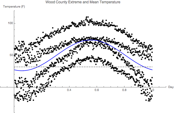
You might get something like this:

Here's all the data: use regression -- linear or non-linear -- to find that function. Either will work!
This is kind of an odd regression problem, because, as you can see, we don't do a very good job of fitting the data! But we're trying to construct an average of all of this data -- not fit any particular data point.
- Problem 2: Fletcher gives us (on pages you haven't seen) the
climate variables Mean Temp, Mean(max), and Mean(min) for the
30-year period 1959-1988 (for the first two), and 1949-1978 for
Mean(min).
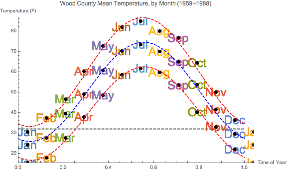
We can fit pretty nice sine functions to those three data sets too, and here they are:

Here's all the data: use regression to find those three function.
- Problem 1: Fletcher gives us the record temperatures, as well
as the years in which they occur. Let's focus on the
temperatures for a moment. What if you try to fit a sine
function to all of this extreme data -- the maxmax, minmax,
maxmin, and minmin data -- simultaneously?
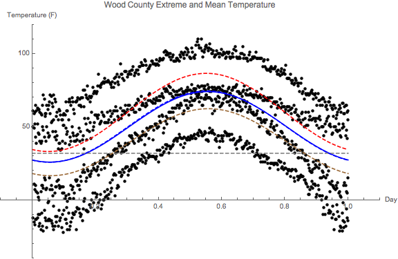
- You don't have to reproduce this figure, but I wanted to show you
what they all look like when plotted together, with Fletcher's record
extreme data:

The mean curves are the blue in the middle. The exceptional thing is that the two mean curves (in blue, one solid, one dashed) are almost exactly on top of each other -- but one was created using 1464=4*366 data points (all of Fletcher's extreme temperature from his tables), whereas the other was created from 12 pieces of data (the climate averages). The two red curves are the fits to the Mean(Max) and the Mean(Min) climate variables (again, 12 pieces of data each).
In my mind I imagine the trajectory of weather getting off "the climate track" (which is represented by the blue -- mean -- and red -- max and min -- curves). Imagine a normal distribution of potential temperatures, whose mean is supposed to be along the blue track, but it wanders; and, as it does, its maximum may go way up there (as will its maxmin); or it could wander low, and its minimum will go way down there (as will its minmax).
That's the story!
So the next question is this: how is the weather wandering?
We have the rest of the semester to figure that out....
- I've prepared a "pre-print" of the paper that could result
from our work on the Fletcher data. I'll share it with you on
Friday. In particular, I want to incorporate any of your ideas
from your "book reports" (of which I have a very sad grand
total of 6/14).
- The Bestiary of functions, from Ben Bolker's Ecological Models and Data in R
- My "DEs in a Day" page.
- Mathematica version of the Tyson, et al. basic model
- If you want to get ahead, our next (and final) mini-project will
be to work on SIR (Susceptible/Infected/Recovered) models of
disease. We're obviously a little more interested in those at the
moment. We'll be adding Death to the models, unfortunately (SIRD
models)....
Some good links that I might recommend (a few of which we'll focus on):
- A great intro to many of the most important question: "When a new virus emerges, no one is immune. A highly transmissible virus, like the coronavirus behind the current pandemic, can spread like wildfire, quickly burning through the dry kindling of a totally naive population. But once enough people are immune, the virus runs into walls of immunity, and the pandemic peters out instead of raging ahead. Scientists call that the herd immunity threshold."
- How
epidemics like covid-19 end (and how to end them faster): A
coronavirus causing a disease called covid-19 has infected more than
70,000 people since it was first reported in late 2019. To predict how
big the epidemic could get, researchers are working to determine how
contagious the virus is.
- The SIR Model for Spread of Disease - Introduction (from the MAA).
In particular, we will implement The SIR Model for Spread of Disease - The Differential Equation Model in InsightMaker.
- Mathematics
of the Corona outbreak, with Professor Tim Britton
(An excellent introduction to SIR models, from both the infectious disease and mathematical sides)
Questions:
- Where is the "calculus moment" in this video?
- How does Britton suggest breaking $R_0$ down into "actionable" pieces?
- This Covid-19 situation is probably more suited to a SIRDs model (with disease-induced death).
- An on-line
model developed by Ashleigh Tuite and David Fisman, Dalla Lana
School of Public Health, University of Toronto
- This one incorporates space into the model. These models are called "agent-based models".
- Could
Coronavirus Cause as Many Deaths as Cancer in the U.S.? Putting
Estimates in Context
This on-line estimator (i.e., a model!) allows one to estimate deaths, as well as death by age-category.
- A nice R-based introduction to infectious diseases and nonlinear differential equations.
- Use of a log-scale (which they take pains to explain) to illustrate deaths by country, updated daily. There is even a separate page at the New York Times to explain log plots: "A Different Way to Chart the Spread of Coronavirus: Those skyrocketing curves tell an alarming story. But logarithmic graphs can help reveal when the pandemic begins to slow."