-
During class time I'll be on Zoom, at
https://nku.zoom.us/j/7057440907.
- Our Last week:
- Monday: Another look what's called "autocorrelation" --
how is a thing correlated with itself? (In this case,
temperatures....), and a tool called the variogram for
capturing (modeling) it.
- Wednesday: How we might simulate a time series, like
temperatures, based off the variogram.
- Review for the final
- Monday: Another look what's called "autocorrelation" --
how is a thing correlated with itself? (In this case,
temperatures....), and a tool called the variogram for
capturing (modeling) it.
- No new homework.
- I hoped to motivate your homework -- why do
we need to compute those models for max and min
temperatures? The key word is simulation.
We can simulate Wood County weather, once we have a model for it, and then see if the distribution of extreme years matches up well with Fletcher's distribution. If we use a model with a linear trend over time, then we're saying "climate change"; if we use a model with no linear trend, then we're saying "no climate change".
I also described the process of randomization, which is essential for generating weather. We want to generate 1000 "realizations" of Wood County weather, then see whether Fletcher's extreme year distribution is outlandish (or not), given an assumption of no climate change.
- In order to proceed, we need those mean functions, which could be
provided by your models for the min/max data from Bowling Green. So
hopefully those come in by Sunday night.
Also, be on the look-out for any outliers. Take a look at the data, to see if there are any funny looking data that we should investigate, too....
- So today I want to illustrate a few further results on the way to
simulation. These are results that I'd hoped to have you
generate, but time waits for no one....
- I mentioned last time that weather is correlated, day by
day:
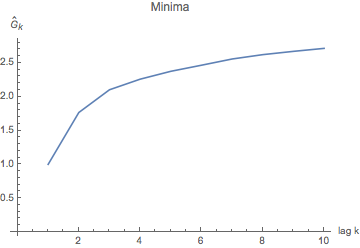
Variance of mins for days a given number of "lags" (days) apart (up to 10). This graph is really just the "nose" on the graph at right -- we zoom in on the first few lags, to see how the variance dives down for mins for days that are within a few days of each other. We think of a "lag" as a delay -- it means we're comparing days lagging by 1, by 2, by 3 days from each other, and so on (up to 10 days apart in this graph).
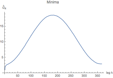
Variance for "lags" up to 365 days apart -- i.e. one year. You may all have heard that you can't trust a weather prediction more than about a week out, and what you're seeing here is a picture of why that is: you can't trust a day 7 days out more than you can a day a year later -- i.e., "what's it usually doing on April 24th?".
What this tells us is that tomorrow's temps are more similar (variance about 1 for minima one day apart) than those 10 days apart (variance 2.7 or so). The graph tells us the obvious: there's a lot of variance between temperatures a half year apart (you may have a winter min compared to a summer min); and that, since temperatures are essentially periodic, temperatures about a year later are also very similar. So what we notice is that, after about a week, the correlation between two mins a week apart is about the same as the correlation between two mins exactly a year apart. A year apart is really "seasonal correlation" (more "climatic", if you will); the correlation for mins just a few days apart is some weather system moving through.... Which has an effect of no more than about a week. - Now the maxes and mins that you hopefully modeled, from Bowling
Green, are not normally distributed:
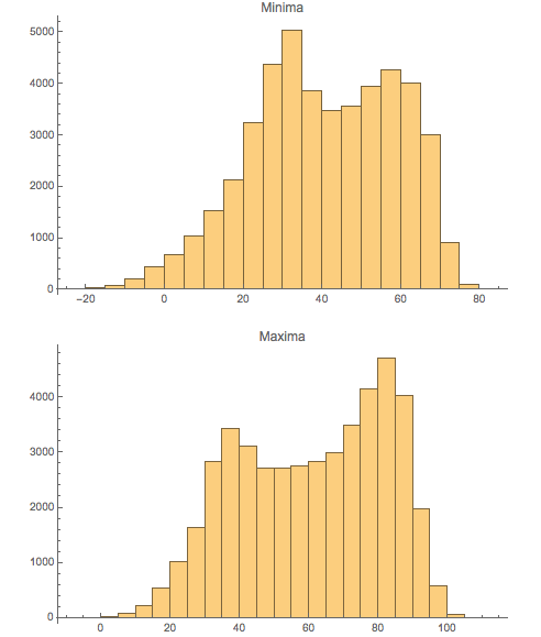
Why do you suppose that is?
For one thing, let's look at the distribution of means and standard deviations of these temperatures across the year, over 127 years:
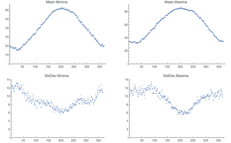
Can you make a good story out of these two graphics -- the histograms above, and the summaries of mins and maxes from below?
- Have a look at the histograms of the residuals after we remove the
sinusoidal trends from the time series for maximum and minimum:

What do you think of those? (I hope that you think that they look pretty damned normal.)
- So here's what is going on: as we wind our way over the course of
the year, the max and min temperatures follow a sinusoidal curve, on
average. However, there is a fair degree of random fluxuation about
that curve: for each day, we have a distribution of about 127 points,
with varying standard deviation throughout the year.
In the summer months, the deviation is lower; in the winter the deviation is higher.
So if we're going to simulate a temperature (let's say a max), you might
- Stop at a date, $t$, and look at the mean for that date, $MeanMaxTemp(t)$; (this is from your model)
- You ask for the distribution of deviations from max temperatures is (estimated from the data for the last 127 years);
- You randomly choose a temperature from the distribution, $\Delta T$;
- You assign temperature $MaxTemp(t)=MeanMaxTemp(t)+\Delta T_t$.
- And then you take a step to the next date.
- But again, this ignores the fact that the temperatures are
correlated from day to day. So we have to model that correlation
as well! (There's a lot of modeling going on here....). So that's the
next step.
- If we focus on those residuals, described above (and by the way,
on day 37 I mentioned the distribution for a
particular day -- start by creating a distribution of mins (or maxes)
for each day of the year from the data: 1/1 through 12/31:
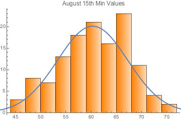
Empirical PDF -- Probability Density Function -- for August 15th Minima with a suggested normal-distribution overlay. Maybe the data isn't normal, but that's just to give you the idea.
We might want to create a theoretical distribution from the empirical data -- otherwise we'd never be able to exceed the extremes of the data (to "create new records").
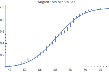
Empirical CDF -- Cumulative Distribution Function -- for August 15th Minima with a normal cdf overlay (I just used the mean and the standard deviation of the empirical data to estimate the normal). Maybe the data isn't normal, but this is just to give you the idea.
By the way, for the randomin
So we're essentially looking at the residuals here -- just with the wrong labels on the x-axis. And these ones look pretty normal.
- So the real trick is to figure out how closely correlated the
temperatures are from day to day, from August 15th to August 16th, as
shown in what are called "the variograms" for the extreme
temperatures. Here's what one group has found for global extreme
temperatures:
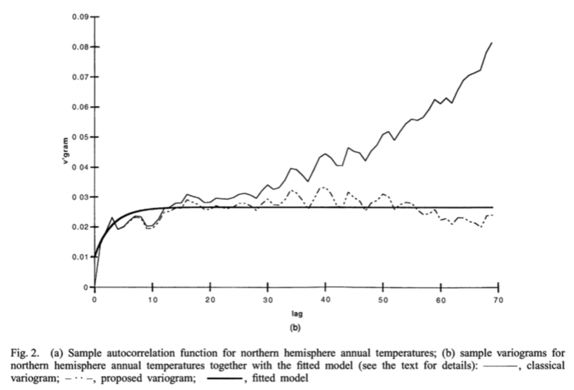
(from a paper by Haslett, On the Sample Variogram and the Sample Autocovariance for Non-Stationary Time Series). The only difference is that their x-axis is in years! They're seeing that, year to year, there is a some similarity, especially for "adjacent years" -- years not too far apart. The tail, heading off into the upper stratosphere, is actually showing that climate change is occuring, probably linearly (in the past to that point -- 1997).
We find roughly the same thing for our data, especially after having removed the trend (which you should have calculated for homework) for the two time series:
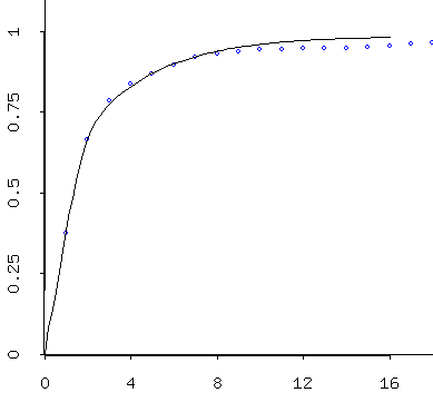
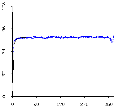
At left: zooming in on the nose of the graph at right. The "empirical variogram" and the "theoretical variogram for the residuals of the minimum temperature model. The graph at left says that for seven day or so (a week) it looks like there really is a stronger correlation between adjacent days' residuals (there's less variance between them) -- after which, as shown in the graph at right -- there doesn't seem to be much going on....
The graph at right says that residuals 180 days apart and 45 days apart are about equally (un)correlated....
The upshot: today's temperature has something to say about the temperature a week from now -- but just barely. Today's temperature has a lot to say about tomorrow's temperature, however....
-
Removing the trend (i.e. the thing you were to calculate for homework)
renders our time series (residuals after trend removal)
relatively stationary -- which basically means that the mean is
the same across the time series -- 0! -- but the non-stationary
part is that the standard deviations of our time series are not equal
across the time series (as shown in one of the earlier graphs). So we
need to do some "regularization" of standard deviation after trend
removal, and then our time series will be "relatively" stationary. At
that point, we compute our variograms, and then put them to use for
simulation.
Notice how nicely the model fits the data (the points) at left. We have modeled what is called the "empirical variogram" (computed from the data) with a "theoretical variogram", which we can then use to generate simulations which will look similar to the original data.
I've used non-linear regression to fit this, but constrained to a class of functions that has certain properties that you'd expect of a variance (the empirical variogram shown is a temporal decomposition of variance -- we've broken the variance down by pairs of points a given "distances in time" apart -- i.e. those 1 day, 2 days, 3 days, etc. apart).
Furthermore, the non-linear regression is weighted: there are more pairs of points 1 day apart than one year apart in the data set -- think about it -- so the variogram shown for "1 day apart pairs" represents a lot more data, so gets more weight.
We can then do this a thousand times, to make a thousand "realizations" of the data -- simulations that look like the data. And from those we can decide if Fletcher's results look realistic, under an assumption of no climate change.
- Whew! That's a lot of stuff. As I say, I wish that I could have
walked you through all that in class. It's a boat-load for a webpage
and a few graphics, and no way of holding up hands and asking
questions!:)
You could ask me questions on Zoom, of course....
Frequently the variogram is used to estimate at unknown locations, as well, through a process called "kriging" -- that is, we could attempt to estimate data where it is missing in the Bowling Green data. There's a lot you can do with a variogram, which is a way of representing data's correlation with itself, either temporally, as in this case, or more often spatially -- the variogram is a really important tool in geology, especially mineral exploration (e.g. mining), where it is used to tell you where to drill for oil next....:(
For that reason, I've often felt a love-hate relationship with what I think of as a beautiful mathematical tool.
- The Bestiary of functions, from Ben Bolker's Ecological Models and Data in R